Overview

Simorka Design Logo

Intro

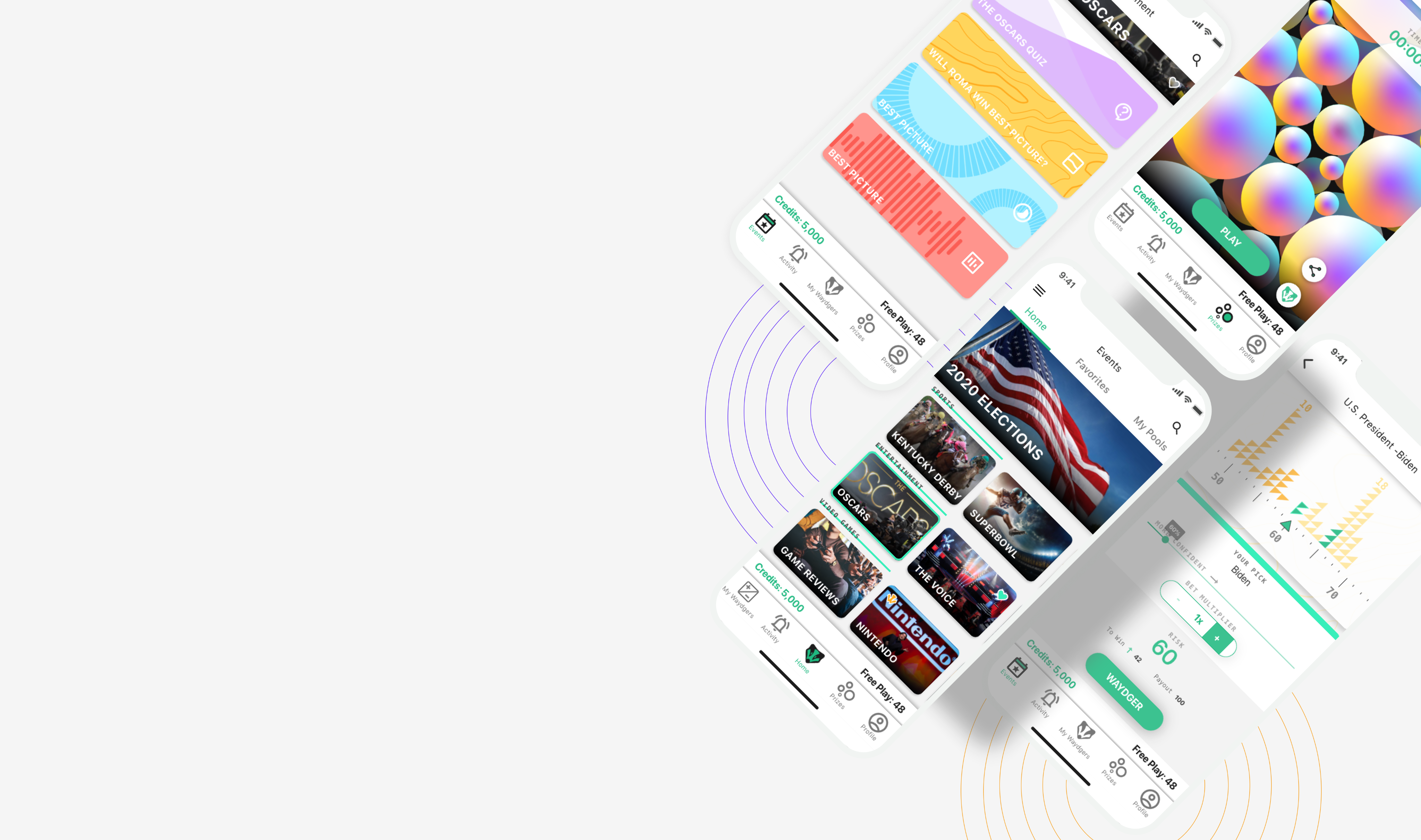
Waydger is a mobile platform for prediction games tied to real events. Players make calls on the Oscars, the Super Bowl, elections, and more, then compete on leaderboards and enter to win prizes. The hard part was range. The app had to hold five distinct game types (Quick Picks, Split The Pot, Stocks, Guesstimate, and Prize Lotteries) plus a social layer, without feeling like five separate apps stitched together.

My Role

I joined as Art Director and owned the design strategy end to end. I set the design principles, the interaction patterns, and the product constraints the team built against. I also wrote the design documentation and built the foundational design system that everything else ran on.

Design Approach

I designed the system as a shared skeleton with room for personality. Every game keeps the same shell: the Challenge, Rules, and Leaders tabs, the bottom navigation, the entry and payout patterns, the credits footer. What changes is the surface. Each game type gets its own color and its own way of showing odds, so Split The Pot reads differently from Stocks even though they sit on the same frame.

That came from a clear constraint. Games are customizable for any event and any audience, so the structure had to stay stable while the content shifted underneath it. I defined the color roles, the type scale, the icon set, and the component states so a new game could ship inside the existing pattern instead of starting from scratch.

Color Scheme

Infographics Color Palette

Typography Scale

Icons Componets

Button and Tile Components

Section Components

Looking Back

This was my first design system, and it holds up where it counts. The structure is sound. Clear color roles, a light and dark split, a numbered scale, and a full state model. Those are the parts that are hard to get right, and they still work.

What I'd change is accessibility. Several of the core pairings fall short of current contrast standards. The green primary with white text is the clearest example. The 87/60/38 emphasis tiers follow the Material pattern of the time, but they break down on colored surfaces.

I'd keep the skeleton and retune the values. Darker text-bearing greens, stronger contrast on the caution and error states, and emphasis levels checked against WCAG rather than set by opacity alone. The system was built to scale. It just needs to scale to a standard I hold now that I didn't then.

Quick Picks

Stocks

Split The Pot

Guesstimate

Project

Halo Media Accessibility Guidelines

Case Study

Identified a gap in Halo Media's services and proposed accessibility audits as a new revenue stream. After approval, I created guidelines and completed the first audit with Mercer Pen Central, improving their Lighthouse score by 37%. The guidelines became the agency's standard.

See Project

© Simorka Designs

All Rights Reserved

Overview

Intro

Waydger is a mobile platform for prediction games tied to real events. Players make calls on the Oscars, the Super Bowl, elections, and more, then compete on leaderboards and enter to win prizes. The hard part was range. The app had to hold five distinct game types (Quick Picks, Split The Pot, Stocks, Guesstimate, and Prize Lotteries) plus a social layer, without feeling like five separate apps stitched together.

My Role

I joined as Art Director and owned the design strategy end to end. I set the design principles, the interaction patterns, and the product constraints the team built against. I also wrote the design documentation and built the foundational design system that everything else ran on.

Design Approach

I designed the system as a shared skeleton with room for personality. Every game keeps the same shell: the Challenge, Rules, and Leaders tabs, the bottom navigation, the entry and payout patterns, the credits footer. What changes is the surface. Each game type gets its own color and its own way of showing odds, so Split The Pot reads differently from Stocks even though they sit on the same frame.

That came from a clear constraint. Games are customizable for any event and any audience, so the structure had to stay stable while the content shifted underneath it. I defined the color roles, the type scale, the icon set, and the component states so a new game could ship inside the existing pattern instead of starting from scratch.

Color Scheme

Infographics Color Palette

Typography Scale

Icons Componets

Button and Tile Components

Section Components

Looking Back

This was my first design system, and it holds up where it counts. The structure is sound. Clear color roles, a light and dark split, a numbered scale, and a full state model. Those are the parts that are hard to get right, and they still work.

What I'd change is accessibility. Several of the core pairings fall short of current contrast standards. The green primary with white text is the clearest example. The 87/60/38 emphasis tiers follow the Material pattern of the time, but they break down on colored surfaces.

I'd keep the skeleton and retune the values. Darker text-bearing greens, stronger contrast on the caution and error states, and emphasis levels checked against WCAG rather than set by opacity alone. The system was built to scale. It just needs to scale to a standard I hold now that I didn't then.

Quick Picks

Stocks

Split The Pot

Guesstimate

© Simorka Designs

All Rights Reserved

Simorka Design Logo
Simorka Design Logo
Simorka Design Logo

Waydger

Design strategy and a foundational system for a prediction gaming platform

Role

Art Director

Duration

8 months

Tools

Adobe XD

Deliverables

IOS Mobile App

Intro

Waydger is a mobile platform for prediction games tied to real events. Players make calls on the Oscars, the Super Bowl, elections, and more, then compete on leaderboards and enter to win prizes. The hard part was range. The app had to hold five distinct game types (Quick Picks, Split The Pot, Stocks, Guesstimate, and Prize Lotteries) plus a social layer, without feeling like five separate apps stitched together.

My Role

I joined as Art Director and owned the design strategy end to end. I set the design principles, the interaction patterns, and the product constraints the team built against. I also wrote the design documentation and built the foundational design system that everything else ran on.

Design Approach

I designed the system as a shared skeleton with room for personality. Every game keeps the same shell: the Challenge, Rules, and Leaders tabs, the bottom navigation, the entry and payout patterns, the credits footer. What changes is the surface. Each game type gets its own color and its own way of showing odds, so Split The Pot reads differently from Stocks even though they sit on the same frame.

That came from a clear constraint. Games are customizable for any event and any audience, so the structure had to stay stable while the content shifted underneath it. I defined the color roles, the type scale, the icon set, and the component states so a new game could ship inside the existing pattern instead of starting from scratch.

Color Scheme

Infographics Color Palette

Typography Scale

Icons Components

Button and Tile Components

Section Components

Looking Back

This was my first design system, and it holds up where it counts. The structure is sound. Clear color roles, a light and dark split, a numbered scale, and a full state model. Those are the parts that are hard to get right, and they still work.

What I'd change is accessibility. Several of the core pairings fall short of current contrast standards. The green primary with white text is the clearest example. The 87/60/38 emphasis tiers follow the Material pattern of the time, but they break down on colored surfaces.

I'd keep the skeleton and retune the values. Darker text-bearing greens, stronger contrast on the caution and error states, and emphasis levels checked against WCAG rather than set by opacity alone. The system was built to scale. It just needs to scale to a standard I hold now that I didn't then.

Quick Picks

Stocks

Split The Pot

Guesstimate

© Simorka Designs

All Rights Reserved