Overview


The Platfrom
Turning ten years of separate screens into one system.
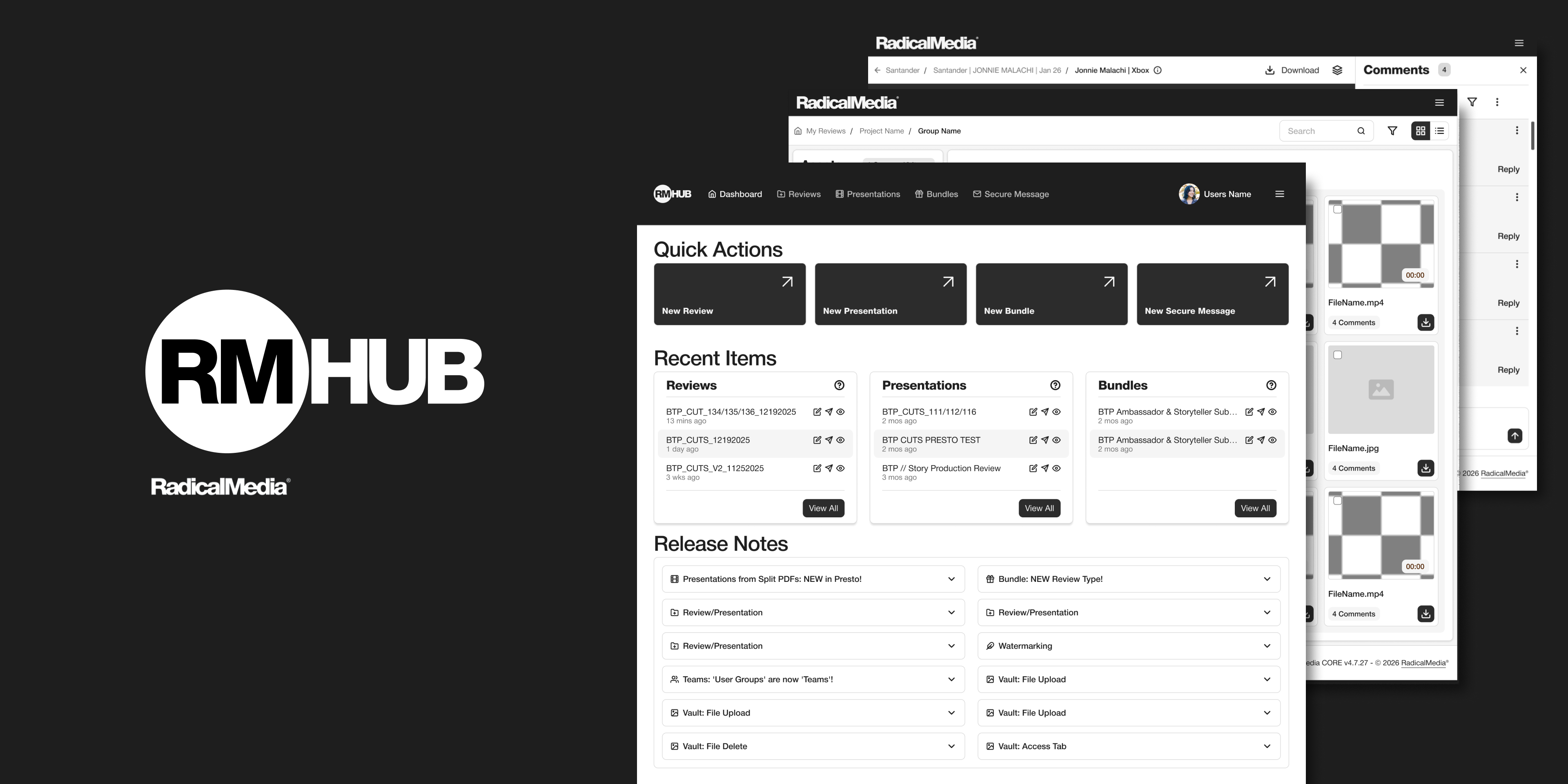
RadicalMedia Hub is how RadicalMedia sends cuts, decks, and full project libraries out for client review. The old version grew screen by screen for years. This is the redesign that put the dashboard, gallery, and media player on one shared system.
The problem
Each part of the product had built its own rules
Over years of feature requests, RadicalMedia Hub had grown into mostly separate tools wearing one name: Reviews, Presentations, Bundles, and Secure Message. Each had picked up its own table style, its own menu pattern, its own version of a button. None of it was wrong exactly. It just didn't agree with itself.
Before changing anything, I mapped the entire existing product, screen by screen, to see the real shape of the problem.
01
No shared file browser
Reviews, Bundles, and Presentations each used a different layout to show a list of assets.
02
Scattered review tools
Comments, sharing, and watermarking lived in different corners of the screen depending on which tool you were in.
03
Drift by copy-paste
New features got built by duplicating the closest existing screen, so small inconsistencies kept compounding.
The system
A component library, not five smaller redesigns
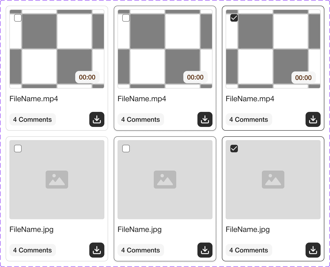
The library covers the pieces every surface leans on: media tiles with rest, hover, and selected states; tables with consistent headers and cell types; tree navigation; menus and dialogs; and a full player control set shared between video and image review.
Media tile · states
Tree navigation
Comment
Playlist
Curated story groupings
The solution
Walking through the rebuilt surfaces
Dashboard
Surface 1 / 3
Quick actions and recent items now sit on a single screen, instead of asking people to remember which tool held what they needed last. Release notes moved here too, so updates don't get buried inside one specific product area.
Gallery
Surface 2 / 3
Quick actions and recent items now sit on a single screen, instead of asking people to remember which tool held what they needed last. Release notes moved here too, so updates don't get buried inside one specific product area.
Media Player
Surface 3 / 3
Scrubber, captions, playlist, and comments are now one consistent control bar, shared between video and image review instead of three slightly different versions depending on which product you opened.
Estimated impact
What this should move
Six different table treatments became one. Three inconsistent player control sets became one shared component, used by both video and image review. New features now start from the library instead of the nearest existing screen.
~20%
Faster review completion time (estimated) — one set of controls instead of three
~30%
Fewer "where do I find X" support tickets (estimated) — comments, sharing, watermarking now live in one place
~40%
More use of comments & watermarking (estimated) — features that were hard to find tend to be under-used

Project
Mercer Beacon Networks
Case Study
Mercer's health consultants used three tools, causing slow, disruptive switching in client meetings. This project combined them into one map-focused platform for real-time client conversations.
See Project
→

© Simorka Designs
All Rights Reserved
Overview
The Platfrom
Turning ten years of separate screens into one system.
RadicalMedia Hub is how RadicalMedia sends cuts, decks, and full project libraries out for client review. The old version grew screen by screen for years. This is the redesign that put the dashboard, gallery, and media player on one shared system.
The problem
Each part of the product had built its own rules
Over years of feature requests, RadicalMedia Hub had grown into mostly separate tools wearing one name: Reviews, Presentations, Bundles, and Secure Message. Each had picked up its own table style, its own menu pattern, its own version of a button. None of it was wrong exactly. It just didn't agree with itself.
Before changing anything, I mapped the entire existing product, screen by screen, to see the real shape of the problem.
01
No shared file browser
Reviews, Bundles, and Presentations each used a different layout to show a list of assets.
02
Scattered review tools
Comments, sharing, and watermarking lived in different corners of the screen depending on which tool you were in.
03
Drift by copy-paste
New features got built by duplicating the closest existing screen, so small inconsistencies kept compounding.
The system
A component library, not five smaller redesigns
The library covers the pieces every surface leans on: media tiles with rest, hover, and selected states; tables with consistent headers and cell types; tree navigation; menus and dialogs; and a full player control set shared between video and image review.
Media tile · states
Tree navigation
Comment
Playlist
Curated story groupings
The solution
Walking through the rebuilt surfaces
Dashboard
Surface 1 / 3
Quick actions and recent items now sit on a single screen, instead of asking people to remember which tool held what they needed last. Release notes moved here too, so updates don't get buried inside one specific product area.
Gallery
Surface 2 / 3
Quick actions and recent items now sit on a single screen, instead of asking people to remember which tool held what they needed last. Release notes moved here too, so updates don't get buried inside one specific product area.
Media Player
Surface 3 / 3
Scrubber, captions, playlist, and comments are now one consistent control bar, shared between video and image review instead of three slightly different versions depending on which product you opened.
Estimated impact
What this should move
Six different table treatments became one. Three inconsistent player control sets became one shared component, used by both video and image review. New features now start from the library instead of the nearest existing screen.
~20%
Faster review completion time (estimated) — one set of controls instead of three
~30%
Fewer "where do I find X" support tickets (estimated) — comments, sharing, watermarking now live in one place
~40%
More use of comments & watermarking (estimated) — features that were hard to find tend to be under-used

Project
Mercer Beacon Networks
Case Study
Mercer's health consultants used three tools, causing slow, disruptive switching in client meetings. This project combined them into one map-focused platform for real-time client conversations.
See Project
→
© Simorka Designs
All Rights Reserved


RadicalMedia Hub
Led a UX audit of a multi-product CMS, designed the shared component system, and redesigned dashboard, gallery, and media player experiences.
Role
UI/UX Designer
Duration
4 Weeks
Tools
Figma, Fig Jam
Scope
Dashboard, Gallery, Media Player, Component library
The Platform
Turning ten years of separate screens into one system.
RadicalMedia Hub is how RadicalMedia sends cuts, decks, and full project libraries out for client review. The old version grew screen by screen for years. This is the redesign that put the dashboard, gallery, and media player on one shared system.
The problem
Each part of the product had built its own rules
Over years of feature requests, RadicalMedia Hub had grown into mostly separate tools wearing one name: Reviews, Presentations, Bundles, and Secure Message. Each had picked up its own table style, its own menu pattern, its own version of a button. None of it was wrong exactly. It just didn't agree with itself.
Before changing anything, I mapped the entire existing product, screen by screen, to see the real shape of the problem.
01
No shared file browser
Reviews, Bundles, and Presentations each used a different layout to show a list of assets.
02
Scattered review tools
Comments, sharing, and watermarking lived in different corners of the screen depending on which tool you were in.
03
Drift by copy-paste
New features got built by duplicating the closest existing screen, so small inconsistencies kept compounding.
The system
A component library, not five smaller redesigns
The library covers the pieces every surface leans on: media tiles with rest, hover, and selected states; tables with consistent headers and cell types; tree navigation; menus and dialogs; and a full player control set shared between video and image review.
Media tile · states
Tree navigation
Comment
Playlist
The solution
Walking through the rebuilt surfaces
Dashboard
Surface 1 / 3
Quick actions and recent items now sit on a single screen, instead of asking people to remember which tool held what they needed last. Release notes moved here too, so updates don't get buried inside one specific product area.
Gallery
Surface 2 / 3
Quick actions and recent items now sit on a single screen, instead of asking people to remember which tool held what they needed last. Release notes moved here too, so updates don't get buried inside one specific product area.
Media Player
Surface 3 / 3
Scrubber, captions, playlist, and comments are now one consistent control bar, shared between video and image review instead of three slightly different versions depending on which product you opened.
Estimated impact
What this should move
Six different table treatments became one. Three inconsistent player control sets became one shared component, used by both video and image review. New features now start from the library instead of the nearest existing screen.
~20%
Faster review completion time (estimated) — one set of controls instead of three
~30%
Fewer "where do I find X" support tickets (estimated) — comments, sharing, watermarking now live in one place
~40%
More use of comments & watermarking (estimated) — features that were hard to find tend to be under-used

© Simorka Designs
All Rights Reserved