


Context
Halo Media was doing strong design work for its clients. But one thing was consistently missing from the agency's service offering: accessibility. No way to help clients understand whether their products were actually usable by people with disabilities.
ADA compliance is a real legal exposure for any organization with a digital product. And increasingly, clients were starting to ask questions about for it. Halo had no clear process.
My Role
I spotted this gap and brought it to leadership as a new service offering. The pitch was straightforward: accessibility audits were something clients needed, competitors were starting to offer, and Halo was leaving on the table. If we built the right internal process and documentation, we could deliver it consistently across client work.
Leadership bought in. I was given the greenlight to build it out.
The Pitch
Before anything could be built, the service needed to be defined. I partnered with Diego Fiorentin, Vice President of Operations at Halo, to put together the pitch deck that framed accessibility as both a compliance need and a business opportunity for clients.
The process I designed covered five pillars:
- Hierarchy
- Color and contrast
- Development handoff
- Touch targets
- Testing
Each had a clear scope and a defined output.
The Audit
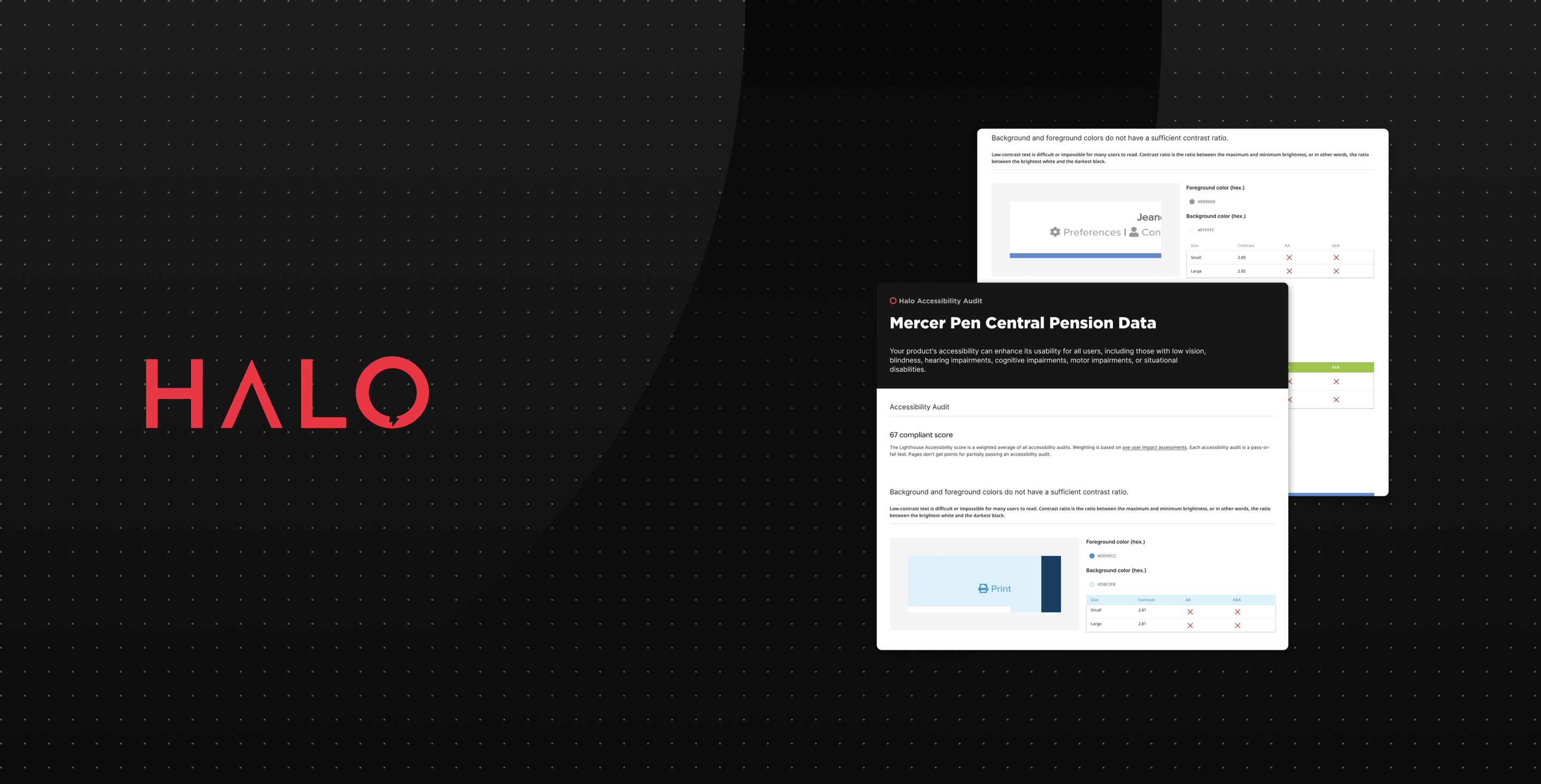
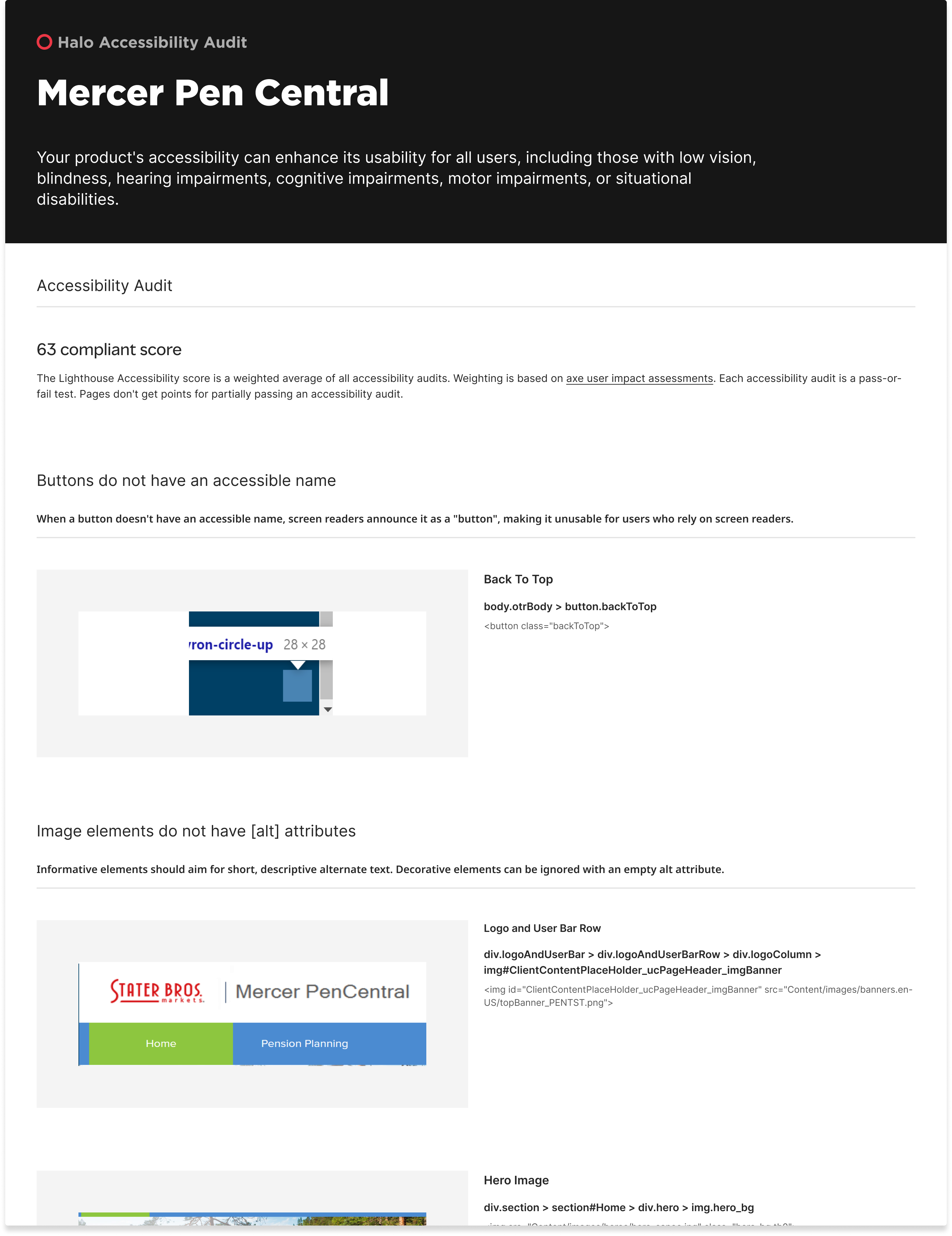
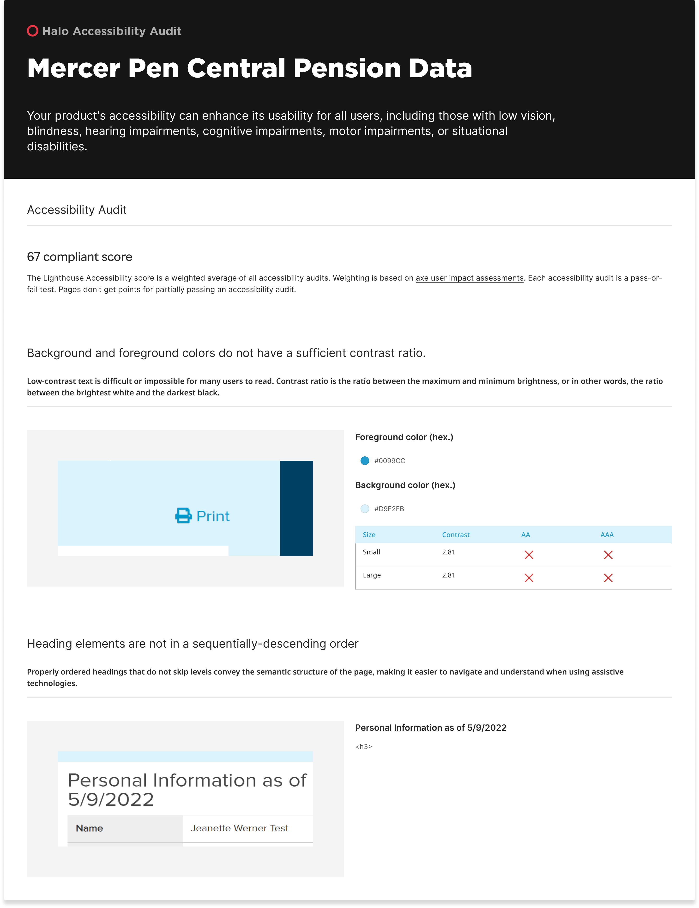
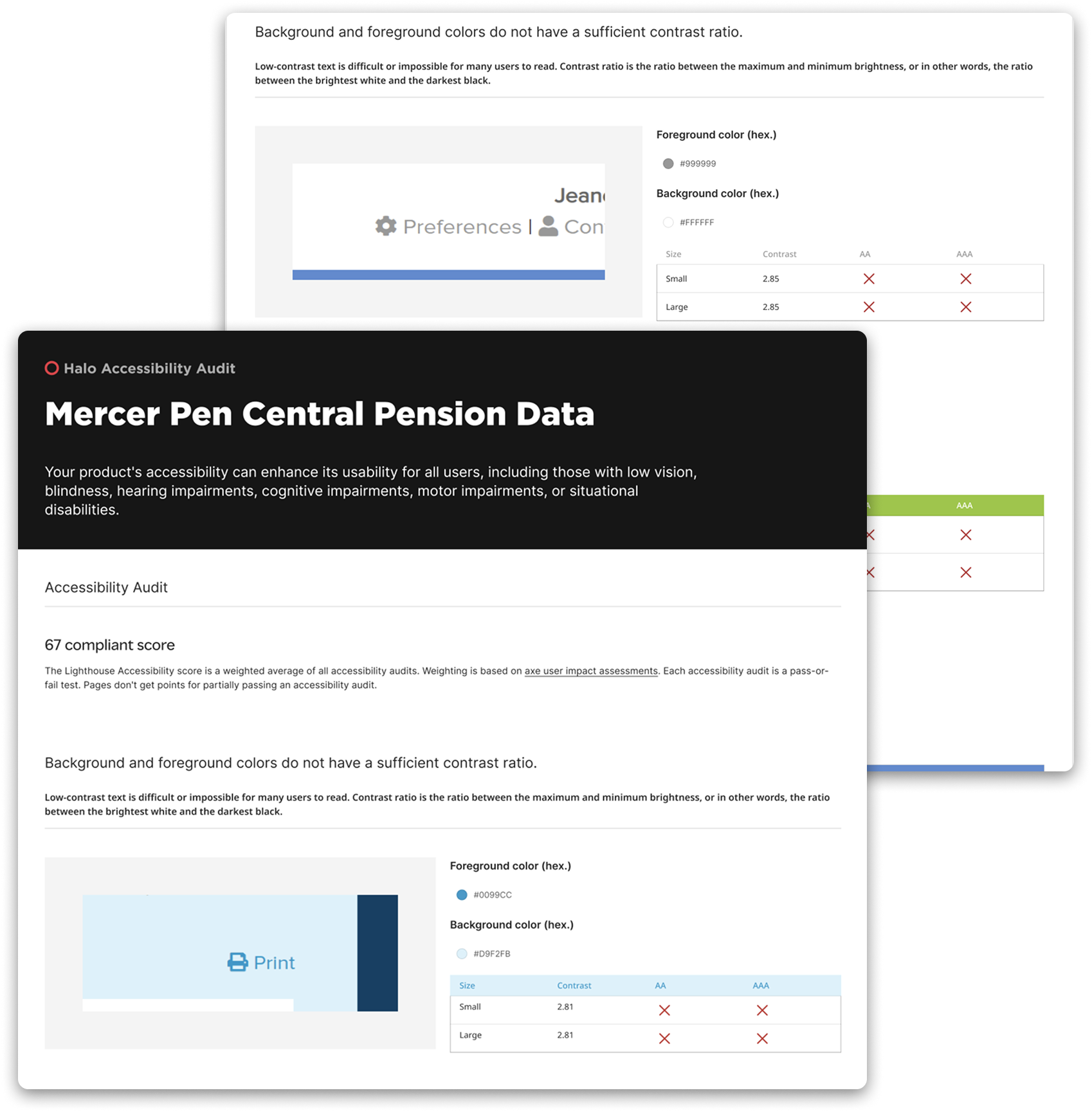
Mercer Pen Central was the first client engagement. I ran a full accessibility audit of their homepage using Lighthouse for scoring and Axe for user impact weighting. The baseline score was 67. Issues included buttons without accessible names, missing alt text, unlabelled form fields, duplicate ARIA IDs, and contrast failures throughout.
Three goals shaped the work:
- Improve the Lighthouse score to 90 or above,
- Make the site navigable for users with disabilities
- Achieve ADA compliance on the homepage.
I documented every issue by severity, then guided the development team through fixes. We brought the score from 67 to 92 . That result became the proof of concept for the service.
The Guidelines
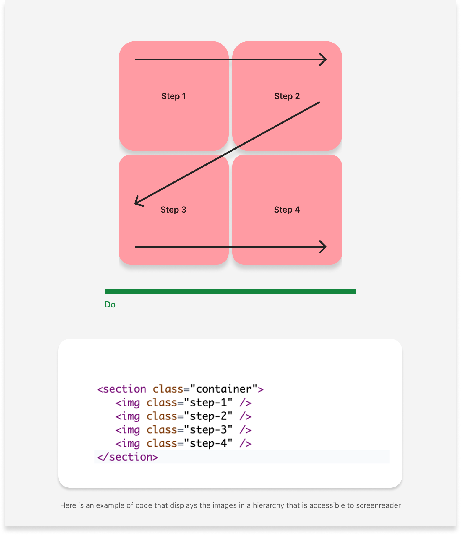
Hierarchy and visual structure
How to use layout, emphasis, and HTML order together so the reading experience matches the visual design. CSS controls appearance, but screen readers follow HTML. That required designers and developers to agree on reading order before anything was built.
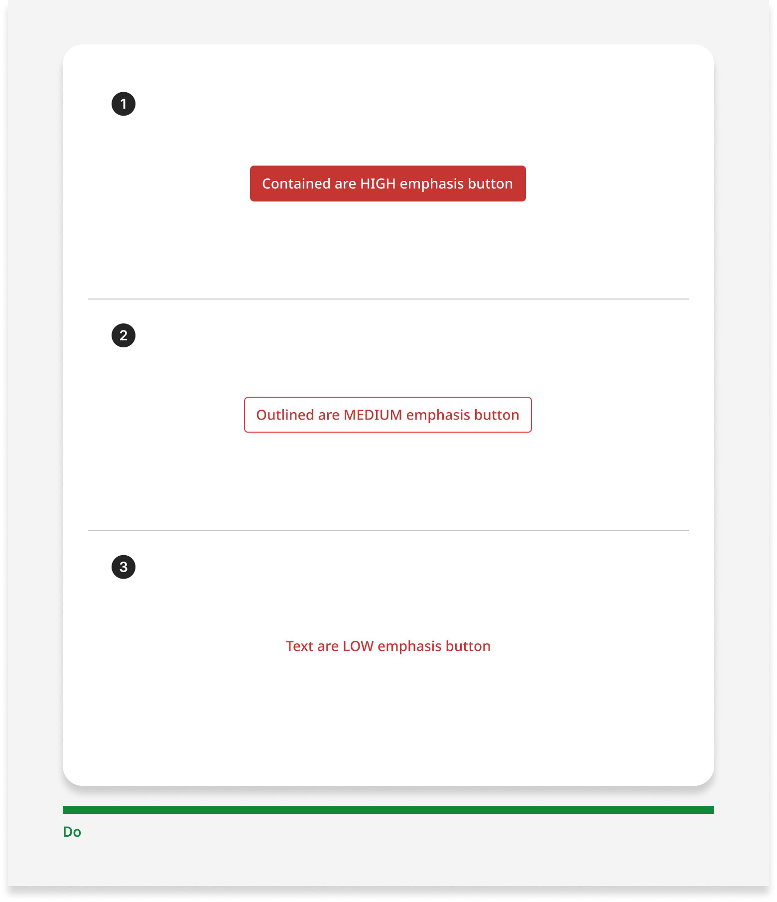
Focus order and actions
How to sequence interactive elements and maintain clear button hierarchy. One high-emphasis action per layout, with secondary actions supporting it.
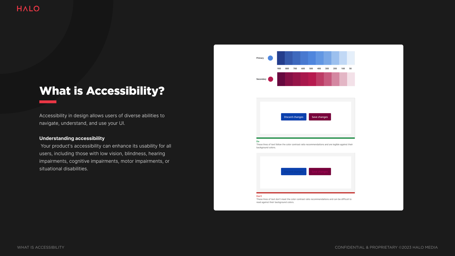
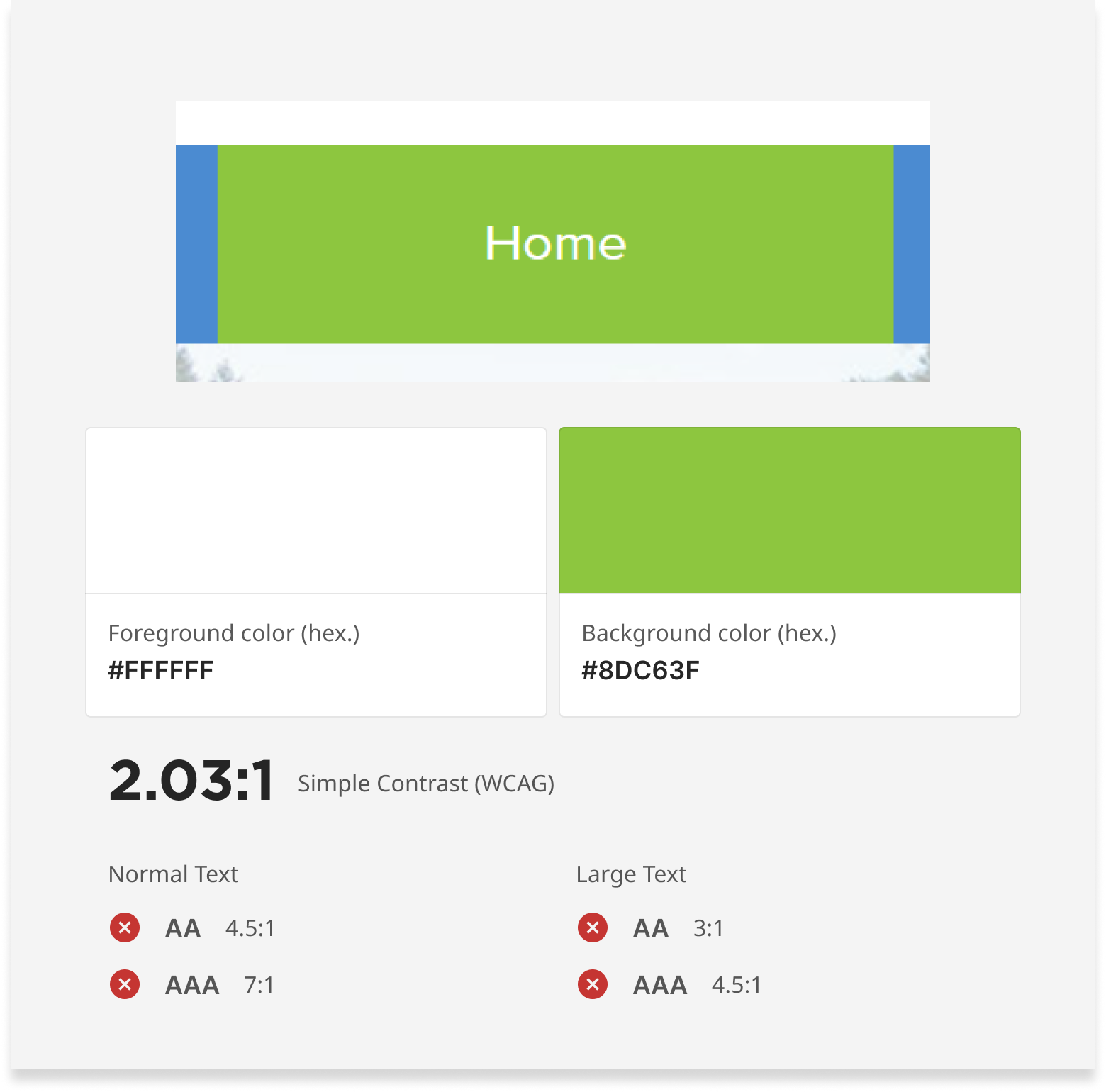
Color and contrast
How to apply the Halo tonal palette in a way that meets WCAG requirements for both text and non-text elements.
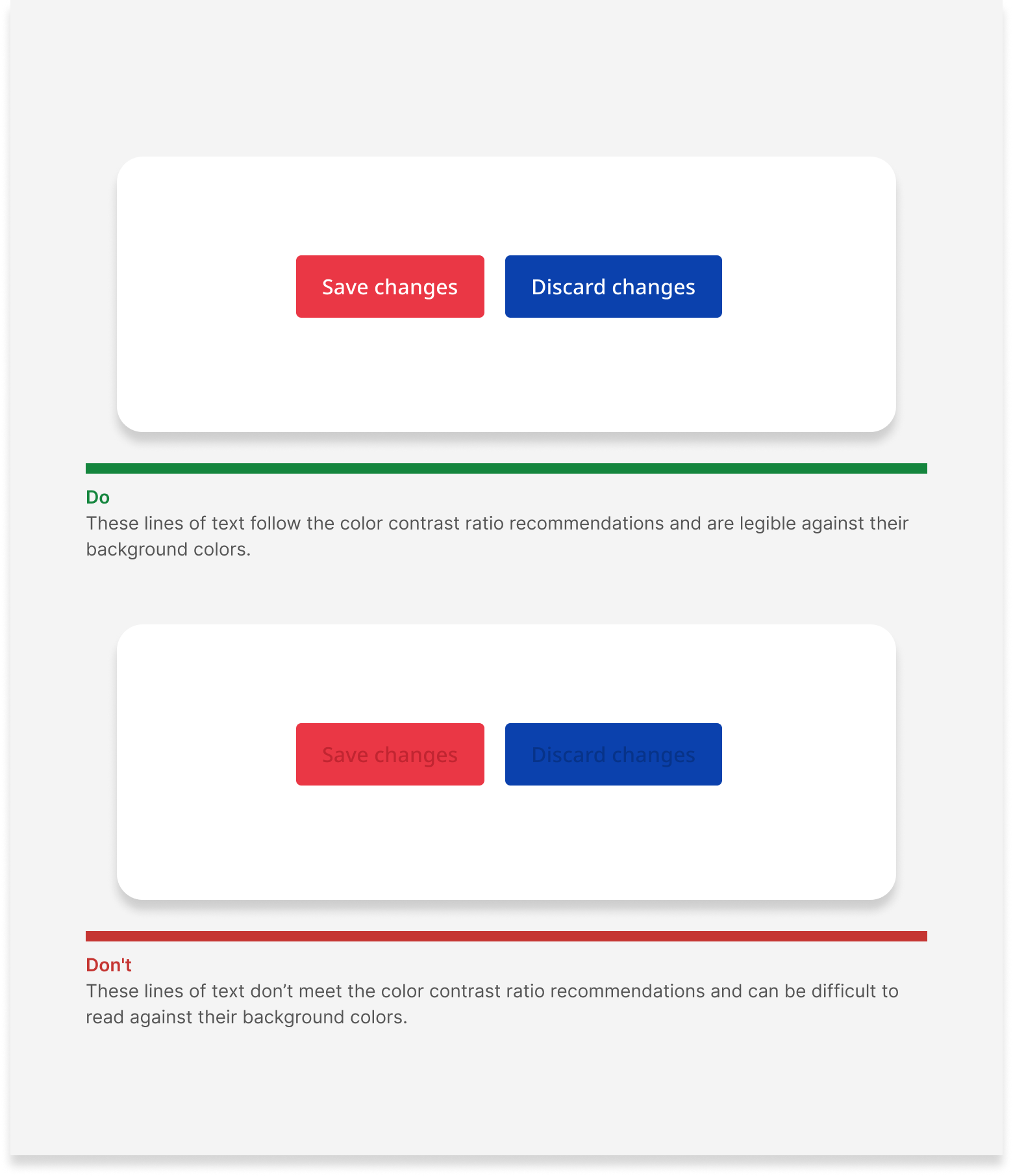
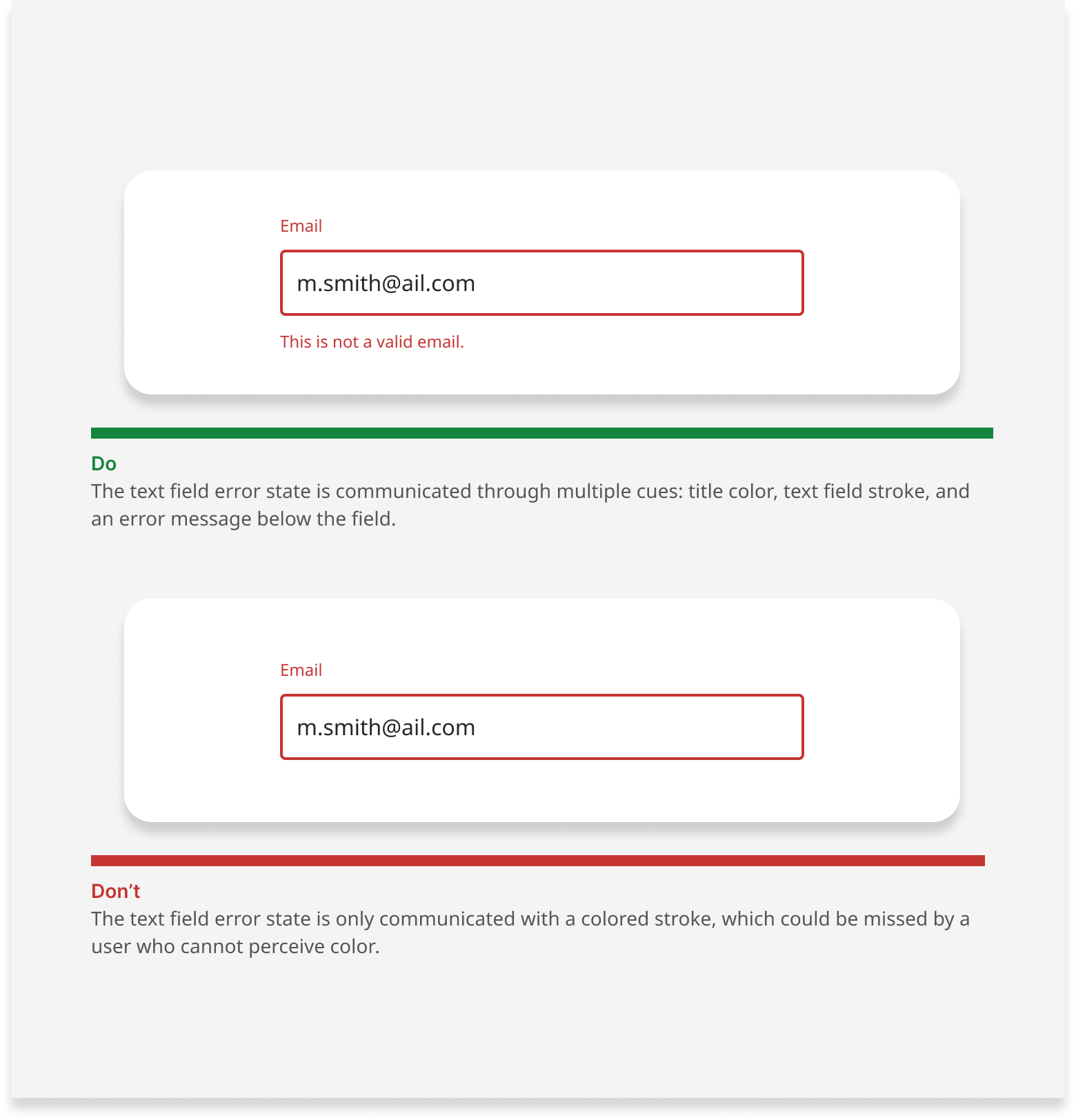
Visual cues beyond color
For users who can't distinguish color, design has to communicate through stroke, pattern, text, and shape.
Impact
Mercer Pen Central's score went from 67 to 92. The site became meaningfully more usable for people with low vision, motor impairments, cognitive disabilities, and situational limitations. The guidelines became Halo's internal standard going forward. The pitch deck became a client-facing sales tool. What started as a gap I noticed turned into a packaged, billable service with a proven delivery model behind it.
The part of this I'm most proud of isn't the score improvement. It's identifying a real business opportunity, making the case for it internally, and then building something the agency could use beyond the first engagement. That required thinking across design, development, and business value at the same time, which is where I find the most interesting problems to solve.


