Overview


01 — Overview
A Platform Needing a Foundation To Scale
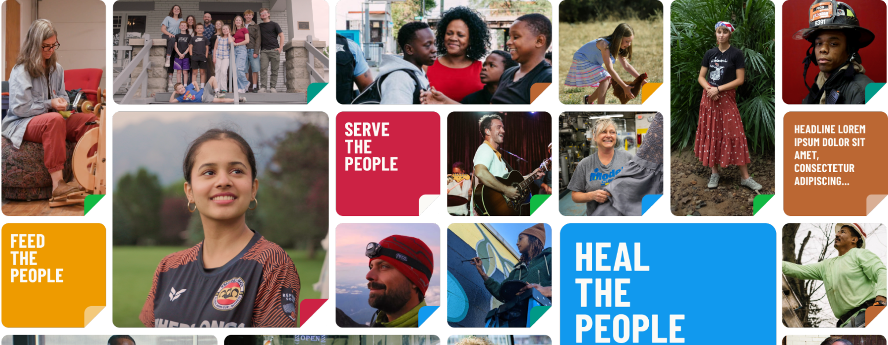
Be The People is a civic storytelling and action platform with a 10-year national mission: connect everyday Americans to community leaders solving real problems, and give those leaders tools to organize and grow their work. With partnerships spanning the NBA, GivingTuesday, and the King Center, the platform launched with significant visibility and reach.
02 - The Platform
Four Core Surfaces, One Design Language
The live platform at stories.bethepeople.org is built around four primary surfaces. Each one has distinct content needs and user goals, but they all need to feel like one product. That shared identity is what the design system had to support.
Each surface pulls from the same token and component library. The token system had to do two things at once: support the brand's black and white palette and six distinct action color groups that run across every surface. Getting that right at the token level meant every component inherited the correct color context without per-screen overrides.
Homepage
Story feed with action filtering
Story Detail
Content page with controls
Explore
Action-based discovery
Collections
Curated story groupings
03 — Approach
Build Against Real Product Need
Components were built in priority order by product surface, not by theoretical completeness. Patterns that appeared most frequently or were blocking active design work came first. Building components without a real use case tends to produce the wrong abstractions.
01
Screen and pattern inventory
Documented all screens and UI patterns to identify what needed components, what needed consolidation, and what was still undefined.
02
Token and naming strategy
Defined color, spacing, and type tokens in a way meaningful to both Figma and code, reducing translation errors at handoff.
03
Component builds with engineering review
Built components iteratively with developer syncs to validate naming, behavior, and state coverage before shipping each category.
04
Spec sheets and governance
Spec sheets stayed in Figma with components, preventing documentation drift. Governance defined how new components are proposed, reviewed, and merged by design and engineering.
04 — The System
Four Categories, One Source of Truth
The Figma component library covers four categories, each mapping to a distinct layer of the interface. Every component includes named variant properties, full state coverage, and semantic color tokens tied to the BTP brand palette. WCAG AA contrast ratios were validated at the token level, so every component built on top of them inherits compliance by default.
Inputs
Form and Selection Controls
Checkbox, Radio, Switch, Text Input, Text Area, Button, Icon Button, and Menu.
Navigation
Wayfinding Patterns
Tabs, Top Nav Tray, Pagination, Link, and Search. Consistent behavior across all breakpoints.
Data Display
Content and Feedback
Status badges, verification states, and dialog variants for story flow and account interactions.
Layout and Structure
Spatial Foundation
Grid system, spacing tokens, and breakpoints for web, tablet, and mobile layouts.
05 — Impact
What the System Made Possible

Faster design velocity
New screens were composed from existing components, reducing estimated design time per screen by approximately 30 to 40%.
Cleaner developer handoff
Spec sheets addressed spacing, states, and behavior upfront, reducing back-and-forth between design and engineering during the build.
Accessibility at launch
WCAG AA compliance met across all components at the token level, eliminating a class of post-launch remediation that is typically expensive to fix under production pressure.
Visual consistency across surfaces
Story pages, project listings, profiles, and navigation all drew from one library, giving the platform a coherent identity at launch.
Media Upload
Alert Component
My Stories
Two Factor Authentiction
06 — Learnings
What This Project Reinforced
A design system is a product in itself. It has users, needs documentation, requires maintenance, and its quality is measured by whether teams actually use it. Treating it as an infrastructure investment rather than a design deliverable changes how you make decisions throughout.
What worked
Engineering involvement from the start
Early developer syncs produced specs that were useful at handoff, not just visually complete.
What to improve
Lock tokens earlier
Some naming decisions required refinement after components were already built. Earlier token validation would have saved rework.
What worked
Docs co-located with components
Keeping spec sheets inside the Figma file meant documentation stayed current as components evolved.
What to improve
Define governance earlier
The contribution process came together toward the end. Formalizing it sooner would have made the build phase cleaner.

Project
Mercer Beacon Networks
Case Study
Mercer's health consultants used three tools, causing slow, disruptive switching in client meetings. This project combined them into one map-focused platform for real-time client conversations.
See Project
→

© Simorka Designs
All Rights Reserved
Overview
01 — Overview
A Platform Needing a Foundation To Scale
Be The People is a civic storytelling and action platform with a 10-year national mission: connect everyday Americans to community leaders solving real problems, and give those leaders tools to organize and grow their work. With partnerships spanning the NBA, GivingTuesday, and the King Center, the platform launched with significant visibility and reach.
02 - The Platform
Four Core Surfaces, One Design Language
The live platform at stories.bethepeople.org is built around four primary surfaces. Each one has distinct content needs and user goals, but they all need to feel like one product. That shared identity is what the design system had to support.
Each surface pulls from the same token and component library. The token system had to do two things at once: support the brand's black and white palette and six distinct action color groups that run across every surface. Getting that right at the token level meant every component inherited the correct color context without per-screen overrides.
Homepage
Story feed with action filtering
Story Detail
Content page with controls
Explore
Action-based discovery
Collections
Curated story groupings
03 — Approach
Build Against Real Product Need
Components were built in priority order by product surface, not by theoretical completeness. Patterns that appeared most frequently or were blocking active design work came first. Building components without a real use case tends to produce the wrong abstractions.
01
Screen and pattern inventory
Documented all screens and UI patterns to identify what needed components, what needed consolidation, and what was still undefined.
02
Token and naming strategy
Defined color, spacing, and type tokens in a way meaningful to both Figma and code, reducing translation errors at handoff.
03
Component builds with engineering review
Built components iteratively with developer syncs to validate naming, behavior, and state coverage before shipping each category.
04
Spec sheets and governance
Spec sheets stayed in Figma with components, preventing documentation drift. Governance defined how new components are proposed, reviewed, and merged by design and engineering.
04 — The System
Four Categories, One Source of Truth
The Figma component library covers four categories, each mapping to a distinct layer of the interface. Every component includes named variant properties, full state coverage, and semantic color tokens tied to the BTP brand palette. WCAG AA contrast ratios were validated at the token level, so every component built on top of them inherits compliance by default.
Inputs
Form and Selection Controls
Checkbox, Radio, Switch, Text Input, Text Area, Button, Icon Button, and Menu.
Navigation
Wayfinding Patterns
Tabs, Top Nav Tray, Pagination, Link, and Search. Consistent behavior across all breakpoints.
Data Display
Content and Feedback
Status badges, verification states, and dialog variants for story flow and account interactions.
Layout and Structure
Spatial Foundation
Grid system, spacing tokens, and breakpoints for web, tablet, and mobile layouts.
05 — Impact
What the System Made Possible
Faster design velocity
New screens were composed from existing components, reducing estimated design time per screen by approximately 30 to 40%.
Cleaner developer handoff
Spec sheets addressed spacing, states, and behavior upfront, reducing back-and-forth between design and engineering during the build.
Accessibility at launch
WCAG AA compliance met across all components at the token level, eliminating a class of post-launch remediation that is typically expensive to fix under production pressure.
Visual consistency across surfaces
Story pages, project listings, profiles, and navigation all drew from one library, giving the platform a coherent identity at launch.
Media Upload
Alert Component
My Stories
Two Factor Authentiction
06 — Learnings
What This Project Reinforced
A design system is a product in itself. It has users, needs documentation, requires maintenance, and its quality is measured by whether teams actually use it. Treating it as an infrastructure investment rather than a design deliverable changes how you make decisions throughout.
What worked
Engineering involvement from the start
Early developer syncs produced specs that were useful at handoff, not just visually complete.
What to improve
Lock tokens earlier
Some naming decisions required refinement after components were already built. Earlier token validation would have saved rework.
What worked
Docs co-located with components
Keeping spec sheets inside the Figma file meant documentation stayed current as components evolved.
What to improve
Define governance earlier
The contribution process came together toward the end. Formalizing it sooner would have made the build phase cleaner.

Project
Mercer Beacon Networks
Case Study
Mercer's health consultants used three tools, causing slow, disruptive switching in client meetings. This project combined them into one map-focused platform for real-time client conversations.
See Project
→
© Simorka Designs
All Rights Reserved


Be The People
Creating UI/UX standards, a Figma library, and developer handoff docs for a national civic storytelling platform.
Role
UI/UX Designer
Duration
6 Months
Tools
Figma
Scope
Design system strategy, Component library, Governance
01 — Overview
A Platform Needing a Foundation To Scale
Be The People is a civic storytelling and action platform with a 10-year national mission: connect everyday Americans to community leaders solving real problems, and give those leaders tools to organize and grow their work. With partnerships spanning the NBA, GivingTuesday, and the King Center, the platform launched with significant visibility and reach.
02 - The Platform
Four Core Surfaces, One Design Language
The live platform at stories.bethepeople.org is built around four primary surfaces. Each one has distinct content needs and user goals, but they all need to feel like one product. That shared identity is what the design system had to support.
Each surface pulls from the same token and component library. The token system had to do two things at once: support the brand's black and white palette and six distinct action color groups that run across every surface. Getting that right at the token level meant every component inherited the correct color context without per-screen overrides.
Homepage
Story feed with action filtering
Story Detail
Content page with controls
Explore
Action-based discovery
Collections
Curated story groupings
03 — Approach
Build Against Real Product Need
Components were built in priority order by product surface, not by theoretical completeness. Patterns that appeared most frequently or were blocking active design work came first. Building components without a real use case tends to produce the wrong abstractions.
01
Screen and pattern inventory
Documented all screens and UI patterns to identify what needed components, what needed consolidation, and what was still undefined.
02
Token and naming strategy
Defined color, spacing, and type tokens in a way meaningful to both Figma and code, reducing translation errors at handoff.
03
Component builds with engineering review
Built components iteratively with developer syncs to validate naming, behavior, and state coverage before shipping each category.
04
Spec sheets and governance
Spec sheets stayed in Figma with components, preventing documentation drift. Governance defined how new components are proposed, reviewed, and merged by design and engineering.
04 — The System
Four Categories, One Source of Truth
The Figma component library covers four categories, each mapping to a distinct layer of the interface. Every component includes named variant properties, full state coverage, and semantic color tokens tied to the BTP brand palette. WCAG AA contrast ratios were validated at the token level, so every component built on top of them inherits compliance by default.
Inputs
Form and Selection Controls
Checkbox, Radio, Switch, Text Input, Text Area, Button, Icon Button, and Menu.
Navigation
Wayfinding Patterns
Tabs, Top Nav Tray, Pagination, Link, and Search. Consistent behavior across all breakpoints.
Data Display
Content and Feedback
Status badges, verification states, and dialog variants for story flow and account interactions.
Layout and Structure
Spatial Foundation
Grid system, spacing tokens, and breakpoints for web, tablet, and mobile layouts.
05 — Impact
What the System Made Possible

Faster design velocity
New screens were composed from existing components, reducing estimated design time per screen by approximately 30 to 40%.
Cleaner developer handoff
Spec sheets addressed spacing, states, and behavior upfront, reducing back-and-forth between design and engineering during the build.
Accessibility at launch
WCAG AA compliance met across all components at the token level, eliminating a class of post-launch remediation that is typically expensive to fix under production pressure.
Visual consistency across surfaces
Story pages, project listings, profiles, and navigation all drew from one library, giving the platform a coherent identity at launch.
Media Upload
Thumbnail Selector
My Stories
Two-Factor Authentication
06 — Learnings
What This Project Reinforced
A design system is a product in itself. It has users, needs documentation, requires maintenance, and its quality is measured by whether teams actually use it. Treating it as an infrastructure investment rather than a design deliverable changes how you make decisions throughout.
What worked
Engineering involvement from the start
Early developer syncs produced specs that were useful at handoff, not just visually complete.
What to improve
Lock tokens earlier
Some naming decisions required refinement after components were already built. Earlier token validation would have saved rework.
What worked
Docs co-located with components
Keeping spec sheets inside the Figma file meant documentation stayed current as components evolved.
What to improve
Define governance earlier
The contribution process came together toward the end. Formalizing it sooner would have made the build phase cleaner.

© Simorka Designs
All Rights Reserved