Overview


The Brand
Browning Environmental Communications works exclusively with clients driving positive environmental change.
Browning Environmental Communications works exclusively with clients driving positive environmental change, public officials, NGOs, investors, philanthropists, scientists, celebrities, influencers, activists, and journalists. They collaborate with that network on behalf of clients to move the needle on environmental issues at every level: global, regional, national, and local.
The brand had the depth. The digital presence didn't.
The Process
Before touching a single page layout,
I built the foundation.
Starting at the atom level.
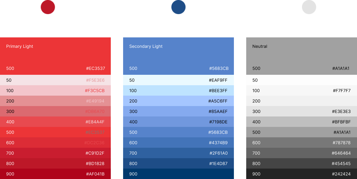
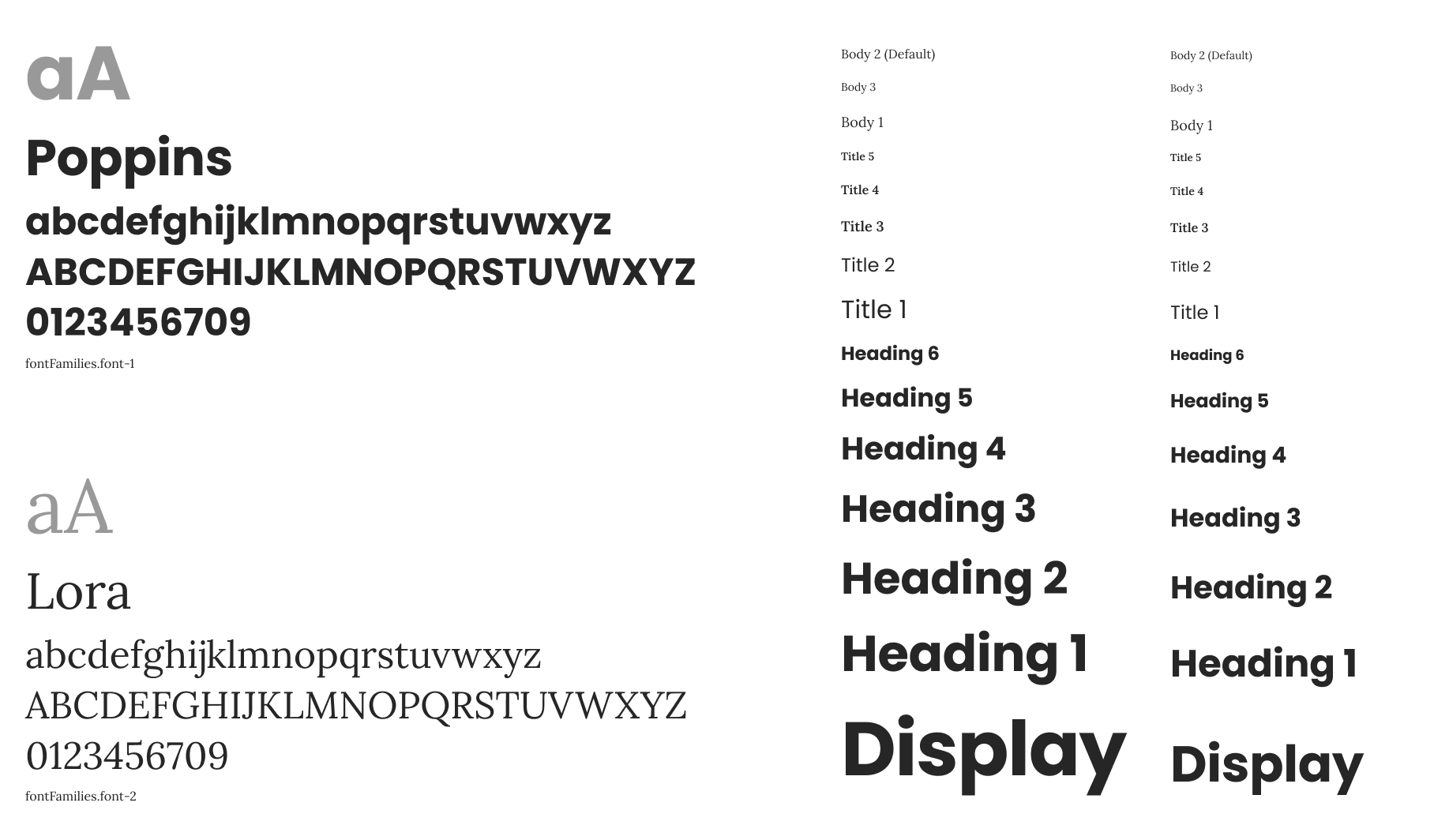
- Color
- Typography
- Spacing
I worked upward through molecules, compounds, and full organisms.
Every layer was validated before the next one began.
By the end, the system included 34 components across five categories.
- Inputs
- Navigation
- Surfaces
- Feedback
- Data display
By the end, the system included
34 components across five categories.
Inputs
Controls for user interaction
Navigation
Patterns for moving through the site
Surfaces
Components that define and separate content areas
Feedback
Responses to user actions
Data display
Structure for presenting information
The Site
Full site redesign
The redesign covered the full site: Home, Services, Work, Case Study, Careers, and Contact — each designed at desktop and mobile breakpoints.
The "be:" hero treatment became the signature element. A flexible pattern that anchored every page with a different brand value. Be credible. Be strategic. Be talented. It gave the site a distinct voice without leaning on copy alone.
The Outcome
Browning got a digital presence that finally matched their brand. Every page draws from the same shared system, so future updates don't require starting over. The design system reduced decision overhead and gave the team a consistent, scalable foundation to build from.

Project
Mercer Marketplace 365+
Case Study
Development of comprehensive visual design systems alongside detailed web design to create cohesive and engaging digital experiences.
See Project
→

© Simorka Designs
All Rights Reserved
Overview
The Brand
Browning Environmental Communications works exclusively with clients driving positive environmental change.
Browning Environmental Communications works exclusively with clients driving positive environmental change, public officials, NGOs, investors, philanthropists, scientists, celebrities, influencers, activists, and journalists. They collaborate with that network on behalf of clients to move the needle on environmental issues at every level: global, regional, national, and local.
The brand had the depth. The digital presence didn't.
The Process
Before touching a single page layout,
I built the foundation.
Starting at the atom level.
- Color
- Typography
- Spacing
I worked upward through molecules, compounds, and full organisms.
Every layer was validated before the next one began.
By the end, the system included 34 components across five categories.
- Inputs
- Navigation
- Surfaces
- Feedback
- Data display
By the end, the system included
34 components across five categories.
Inputs
Controls for user interaction
Navigation
Patterns for moving through the site
Surfaces
Components that define and separate content areas
Feedback
Responses to user actions
Data display
Structure for presenting information
The Site
Full site redesign
The redesign covered the full site: Home, Services, Work, Case Study, Careers, and Contact — each designed at desktop and mobile breakpoints.
The "be:" hero treatment became the signature element. A flexible pattern that anchored every page with a different brand value. Be credible. Be strategic. Be talented. It gave the site a distinct voice without leaning on copy alone.
The Outcome
Browning got a digital presence that finally matched their brand. Every page draws from the same shared system, so future updates don't require starting over. The design system reduced decision overhead and gave the team a consistent, scalable foundation to build from.

Project
Mercer Marketplace 365+
Case Study
Development of comprehensive visual design systems alongside detailed web design to create cohesive and engaging digital experiences.
See Project
→
© Simorka Designs
All Rights Reserved


Browning Environmental Communications
Led design system and site redesign end to end. Collaborated with stakeholders to develop design principles, patterns, constraints, and documentation using Atomic Design. This ensured consistency and made the system intuitive and scalable.
Role
Senior UI Designer (Contracted)
Duration
2 months
Tools
Figma
Scope
Design system, Site redesign,
Desktop & mobile
The Brand
Browning Environmental Communications works exclusively with clients driving positive environmental change.
Public officials, NGOs, investors, philanthropists, scientists, celebrities, influencers, activists, and journalists. They collaborate with that network on behalf of clients to move the needle on environmental issues at every level: global, regional, national, and local.
The brand had the depth. The digital presence didn't.
The Process
Before touching a single page layout,
I built the foundation.
Starting at the atom level.
- Color
- Typography
- Spacing
I worked upward through molecules, compounds, and full organisms.
Every layer was validated before the next one began.
By the end, the system included
34 components across five categories.
Inputs
Controls for user interaction
Navigation
Patterns for moving through the site
Surfaces
Components that define and separate content areas
Feedback
Responses to user actions
Data display
Structure for presenting information
The Site
Full site redesign
Home, Services, Case Study, Careers, and Contact, each designed at desktop and mobile breakpoints.
The "be:" hero treatment became the signature element. A flexible pattern that anchored every page with a different brand value. Be credible. Be strategic. Be talented. It gave the site a distinct voice without leaning on copy alone.
The Outcome
Browning got a digital presence that finally matched their brand. Every page draws from the same shared system, so future updates don't require starting over. The design system reduced decision overhead and gave the team a consistent, scalable foundation to build from.

© Simorka Designs
All Rights Reserved