The Challenge
Shoppers frequently miss out on potential savings because finding, activating, and applying deals is fragmented and often forgotten at checkout. Competing solutions like Honey and Rakuten had set a high bar for user expectations. BenefitHub needed an extension that could compete with those standards while maintaining its brand identity. The challenge was to surface relevant deals without interrupting the shopping flow, build trust through clear activation states, and provide gentle reminders through checkout. All while working consistently across multiple browsers.
Competitor Research
Analyzing Rakuten, Honey and Coupert surfaced clear gaps in activation UX and checkout trust, patterns that directly shaped the design decisions below.

Rakuten
Strength:
- Clear cashback activation with strong confirmation
- Persistent active state builds trust during shopping
Weaknesses:
- Post-activation flow adds complexity (Activated → Purchase → Withdraw).
- Heavy urgency (timers, alerts) creates pressure, not clarity.

Honey
Strength:
- Seamless coupon discovery and auto-application at checkout
- Minimal friction with a “set it and forget it” experience
Weaknesses:
- Lack of visibility into what’s happening reduces user confidence
- Limited feedback after coupons are applied or fail

Coupert
Strength:
- Clear cashback activation with strong visual confirmation
- Persistent active state (badge + overlay) builds trust during shopping
Weaknesses:
- Dense UI with too many options at once
- Decision fatigue due to lack of prioritization or guidance
The Solution
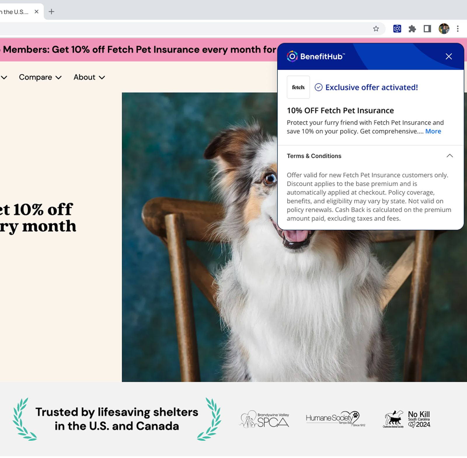
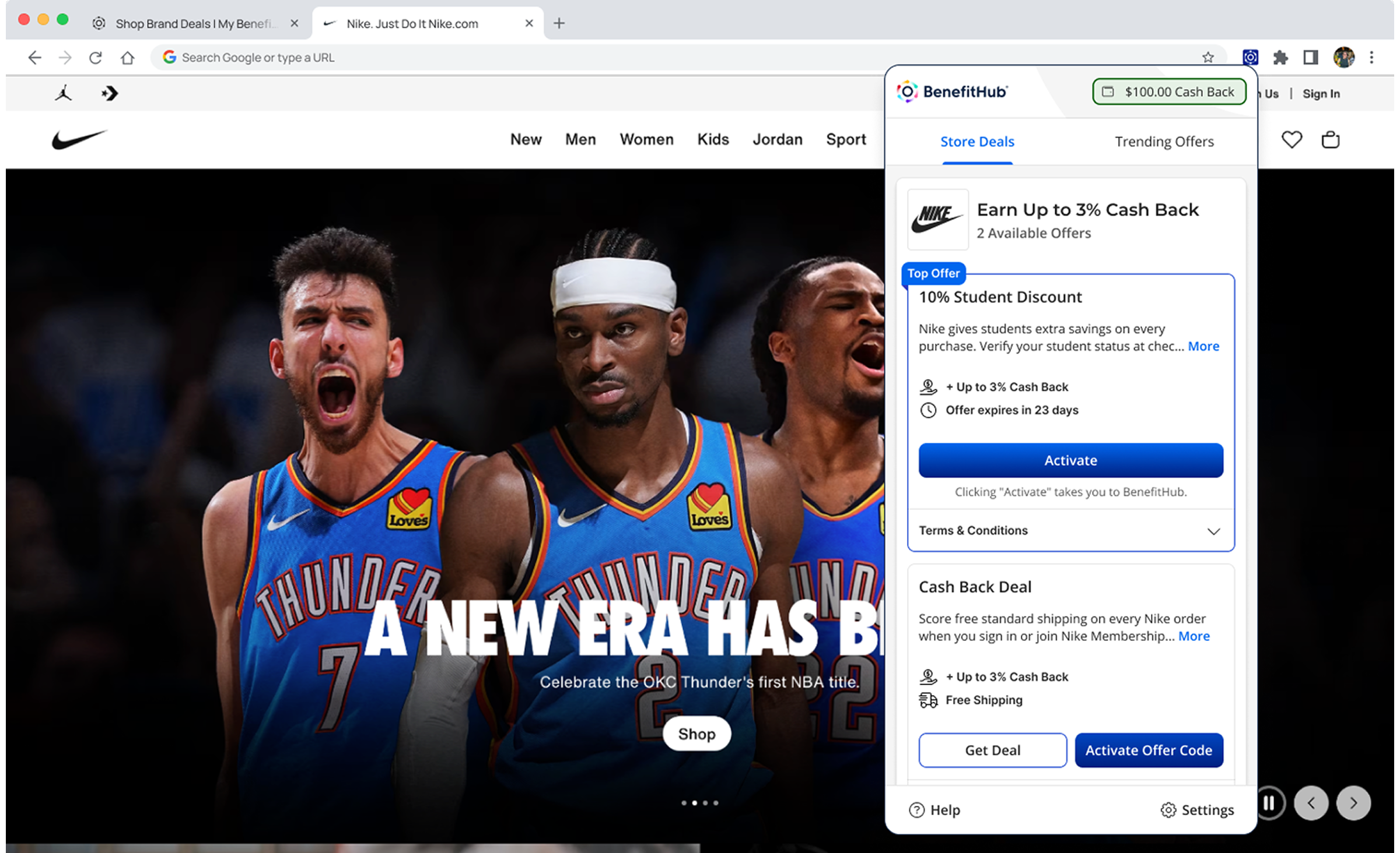
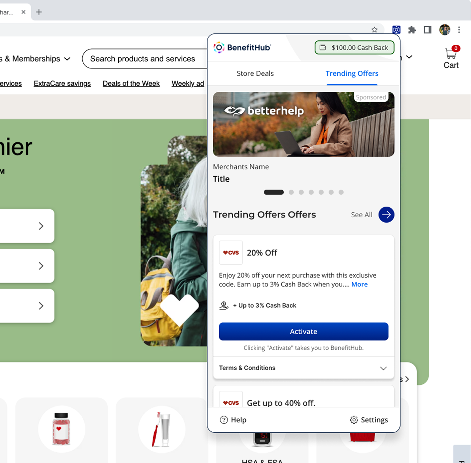
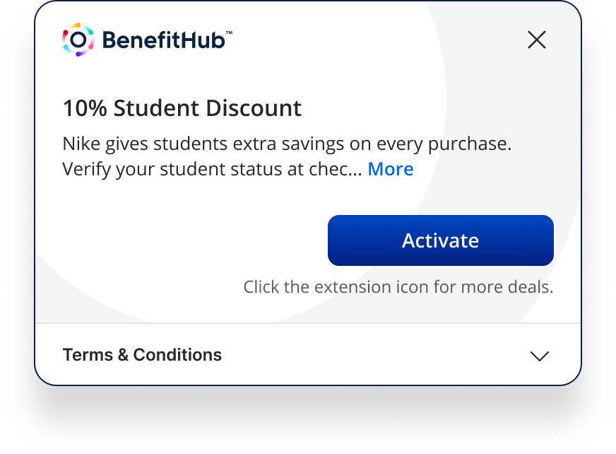
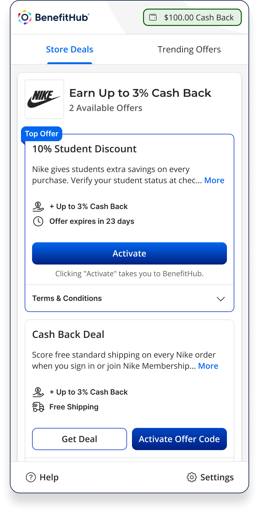
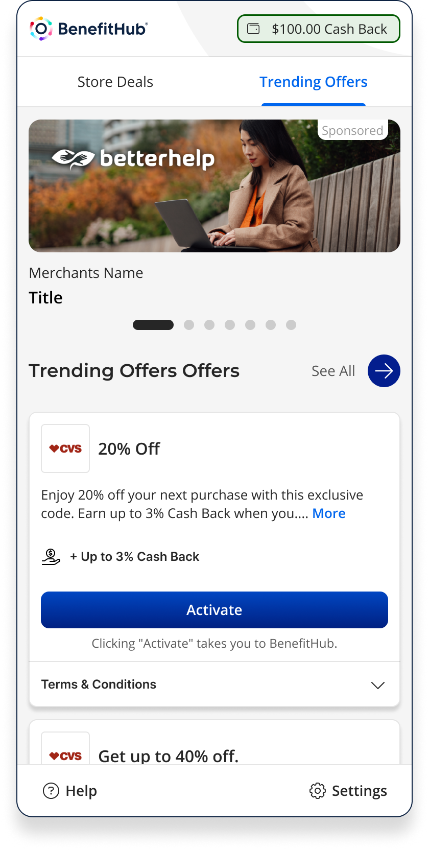
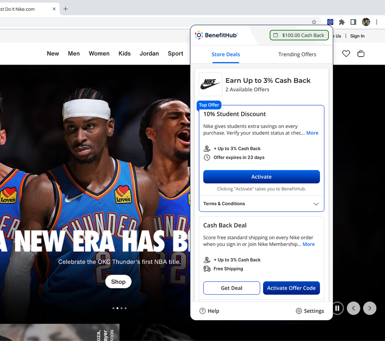
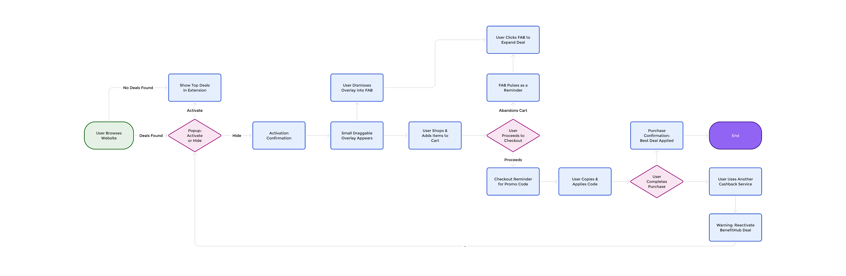
I designed the extension around three states that map directly to the shopping journey: deal discovery, active deal confirmation, and checkout reminder. During deal discovery, the extension displays a popup that presents available offers with clear options to either “Activate” or “Hide.” If a promo code is required, it can be quickly copied or auto-applied. Once activated, a draggable overlay confirms that the deal is live, which can be collapsed into a floating action button for a less intrusive experience. Finally, at checkout, subtle reminders prompt users to copy and apply promo codes, while confirmation messages reassure them that they’ve secured the best BenefitHub pricing. Re-engagement tactics, such as a pulsing button or follow-up emails, nudge users back if they abandon their cart.


Core Principles
Our design approach focused on clarity, trust, and ease of use. Deals needed to feel transparent and reliable, activation had to be seamless with minimal clicks, and reminders were designed to be helpful without being disruptive. These principles guided every design decision, ensuring the extension felt like a natural companion to the shopping journey.
Journey Mapping
User flows and wireframes were created to map every possible state of the extension from browsing a website with no deals available, to activating and confirming offers, to reminders at checkout. These visuals helped align stakeholders and guided development through a clear, consistent vision.
Outcome
The extension gave BenefitHub a presence at the point of purchase, the moment where competitors like Honey and Rakuten had the advantage. Designed to surface deals without interrupting the shopping flow, and to guide users through activation rather than expecting them to figure it out.