Overview


01 — THE SITUATION
No shared tooling.
No design component library.
No reusable patterns.
When I joined BenefitHub, there was no shared design tooling, no component library, and no reusable patterns. The product team was working in Adobe XD. Designers and engineers were making UI decisions independently, which meant inconsistencies across every surface of the product.
Before I could build anything, I had to move the team onto a shared foundation. And before I could do that, I had to get the organization to agree it was worth doing.
02 — STARTING POINT
I was handed two screenshots:
a typography reference and a color table. That was it.
No Figma files. No tokens. No documentation. Just a style guide that lived in a PNG.
My job wasn't just to build a component library. It was to create the infrastructure that would let a product team design and build consistently at scale, starting from zero.
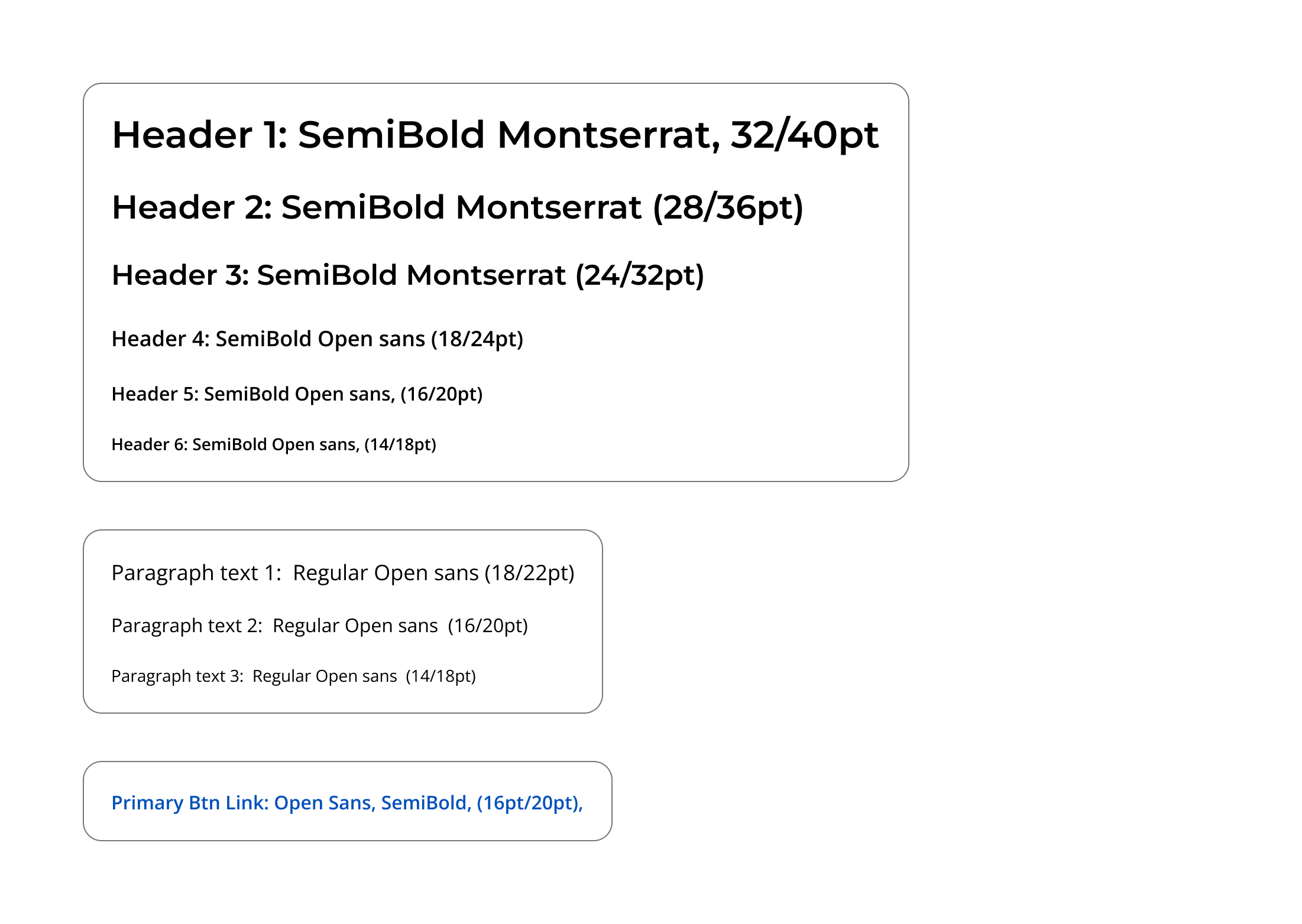
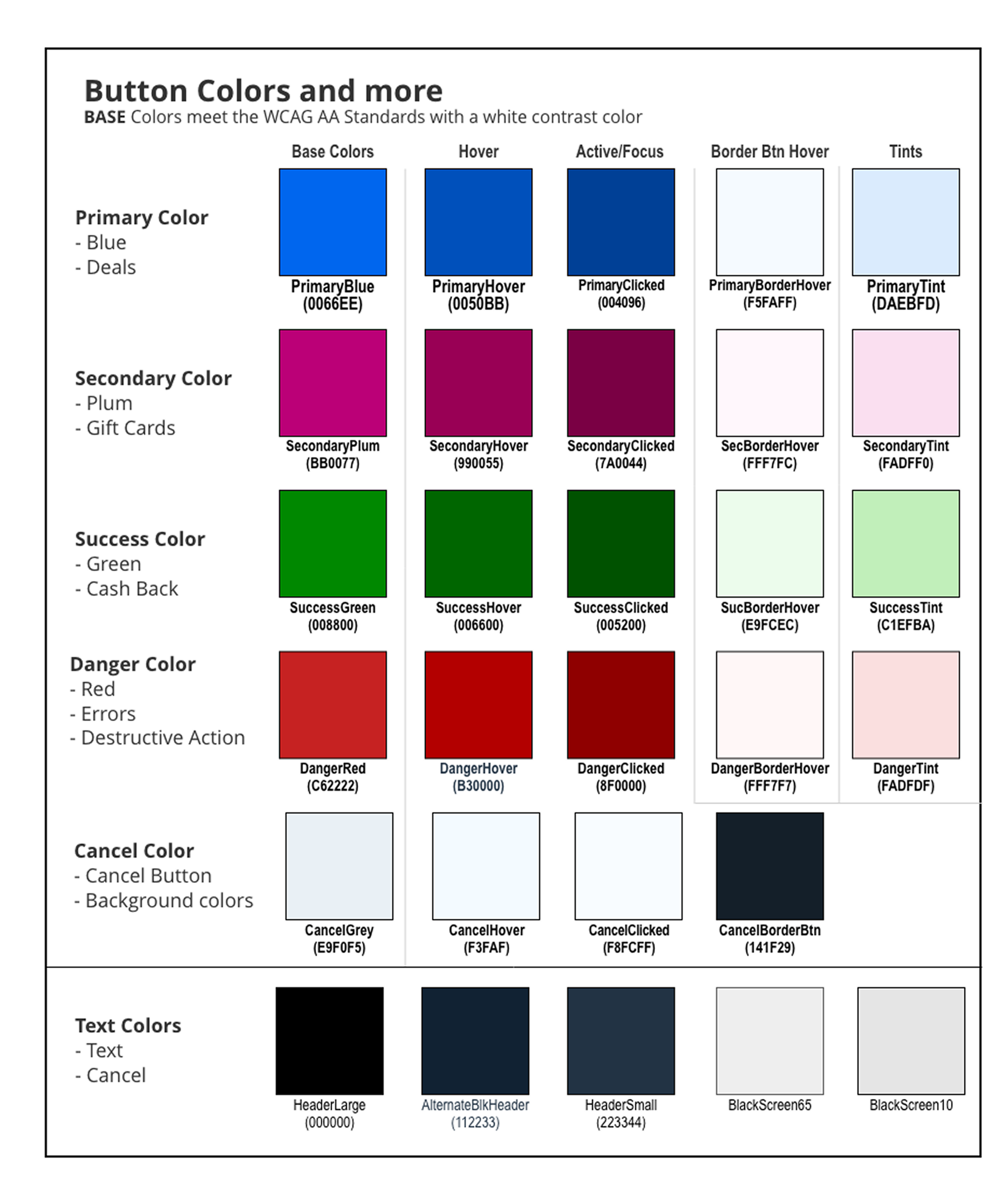
The entire design foundation I was given to work from.
03 — MIGRATING THE TEAM TO FIGMA
Before I could build a design system, I had to move an entire organization to a new tool.
The team used Adobe XD. To build a design system, I had to move the product organization to a new tool and get executive approval.
I wrote a migration proposal for five stakeholders: Senior Product Manager, Director of Product, Development Manager, VP of Engineering, and CIO. It outlined a phased, year-long plan with success indicators.
The migration had four phases. Months 1-3 focused on stakeholder alignment, screen selection, and securing Figma seats. Months 4-6 piloted Figma on projects and started the component library with the development manager. Months 7-9 expanded migration to core projects, built the full component library, and set design system foundations like tokens and accessibility. The final phase completed the transition, optimized workflows, and tested the system on live projects.
Getting the CIO in the room meant the migration had teeth. Without that organizational commitment, it would have stalled at the team level.
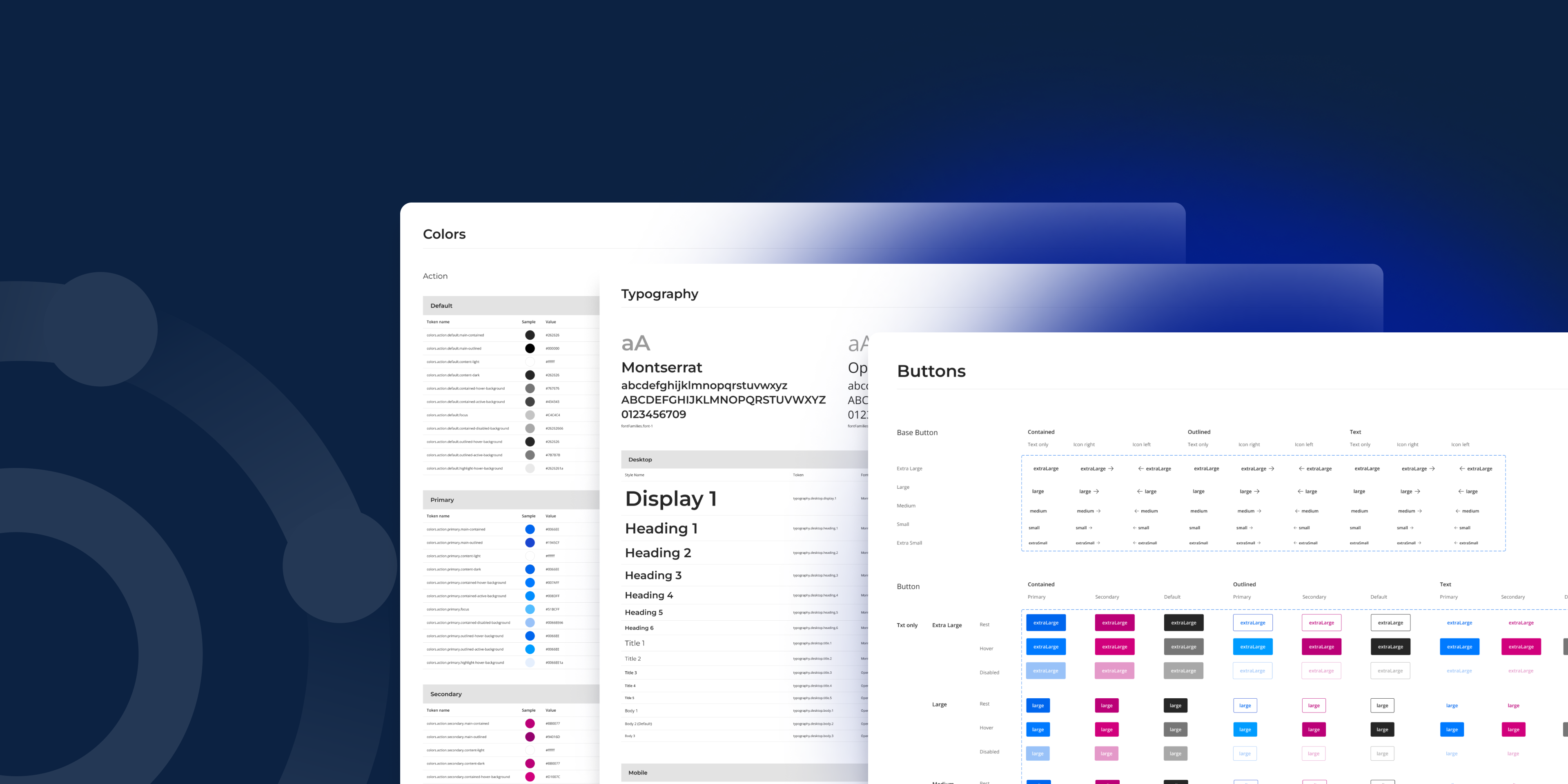
04 — BUILDING THE DESIGN LANGUAGE
With the team in Figma, I built the foundational layer that everything else would inherit from.
I structured the color system semantically, not just as a palette. Every color role had a full set of states: base, hover, active, border, and tint. That covered primary blue, secondary plum, success green, danger red, cancel grey, and text colors. Engineers could implement these predictably because the naming reflected intent, not just appearance. Colors were validated against WCAG AA standards at the token level, which meant accessibility was built into the defaults rather than audited after the fact.
Typography used two typefaces with clear roles. Montserrat handled headers at display and heading sizes. Open Sans covered body text, labels, and UI copy. I defined a full scale across both, with six heading levels, three paragraph sizes, and consistent line heights throughout.
Layout grids were documented across three breakpoints: small, medium, and large. Every component built after that was designed with responsive behavior in mind from the start, not retrofitted later.
05 — THE COMPONENT LIBRARY
With the foundation in place, I built 35 components covering every layer of the product.
Form controls were complex and critical, including text inputs, checkboxes, radio buttons, switches, sliders, and file uploaders. They worked across sizes, states, and colors while staying accessible. I documented error, disabled, hover, and helper text patterns.
Navigation components covered the product: app bar with desktop and mobile variants, bottom navigation for mobile, breadcrumbs, tabs, pagination, and drawer. Each fit the BenefitHub brand and supported various pages.
Feedback and overlay components included alerts with semantic colors and countdowns, snackbars in light and dark, dialogs in four sizes, tooltips with nine arrow variants, and a tooltip stepper for onboarding.
Data display components covered cards, tables with sorting and selection, lists with nesting and content variations, and chips in semantic colors with avatar, icon, and removable variants.
Brand components included the logo in full color and monochrome, ensuring brand consistency and a single source of truth for engineers.
Product-specific components connected to BenefitHub mechanics. The copy button handles discount code display and copying with rest, hover, copied, and disabled states. The tooltip stepper with Previous and Next navigation supports feature discovery and onboarding.
Button System
Scale and semantic structure across all variants
Alert Component
Full color system applied to a real pattern
Chip Component
Variant depth across semantic colors and configurations
Copy Button
Component for discount code interaction
App Bar
Responsive behavior across desktop and mobile
06 — BUILT WHILE SHIPPING
The system wasn't built in isolation.
The Figma migration and the component library were built in parallel with active product work. While the system was taking shape, I was also shipping features: redesigning the mobile app, building the browser extension, overhauling the insurance funnel, and redesigning the giveaways campaign. Every component had to work immediately, not just in theory.
07 — THE SYSTEM IN USE
The design system shipped into a live product.
The app bar, card components, chips, pagination, breadcrumbs, alerts, and bottom navigation are all visible across the homepage, category pages, brand pages, and giveaways campaign. The countdown alert component, built specifically for BenefitHub's giveaway mechanic, appears exactly as designed in the Figma system. Every surface of the product is running on the same shared foundation.
08 — OUTCOMES
A system that moved the numbers.
The system reduced developer handoff time by 25%.
Engineers stopped asking which button variant to use or where to find the right color value. Decisions that used to require back-and-forth were answered by the documentation.
Design velocity improved because new screens could be assembled from existing components rather than rebuilt from scratch. Accessibility became easier to maintain because contrast and color roles were validated at the token level. The mobile app redesign, insurance funnel overhaul, and giveaways campaign all benefited from having a shared system to build from.
The migration itself was completed within the year, with Figma fully adopted across design, product, and development.
09 — WHAT I'D DO DIFFERENTLY
Reflection.
I built the system while shipping product work in parallel, which meant some components were documented after the fact rather than before. In retrospect, I'd advocate earlier for dedicated system time rather than threading it between feature sprints. A design system built under pressure can accumulate the same kind of debt it's meant to prevent.
I'd also invest more in contribution guidelines earlier. The system grew through my own decisions. A clearer process for how other designers or engineers could propose additions would have made it more durable over time.

Project
Mercer Beacon Networks
Case Study
Mercer's health consultants used three tools, causing slow, disruptive switching in client meetings. This project combined them into one map-focused platform for real-time client conversations.
See Project
→

© Simorka Designs
All Rights Reserved
Overview
01 — THE SITUATION
No shared tooling.
No design component library.
No reusable patterns.
When I joined BenefitHub, there was no shared design tooling, no component library, and no reusable patterns. The product team was working in Adobe XD. Designers and engineers were making UI decisions independently, which meant inconsistencies across every surface of the product.
Before I could build anything, I had to move the team onto a shared foundation. And before I could do that, I had to get the organization to agree it was worth doing.
02 — STARTING POINT
I was handed two screenshots:
a typography reference and a color table. That was it.
No Figma files. No tokens. No documentation. Just a style guide that lived in a PNG.
My job wasn't just to build a component library. It was to create the infrastructure that would let a product team design and build consistently at scale, starting from zero.
The entire design foundation I was given to work from.
03 — MIGRATING THE TEAM TO FIGMA
Before I could build a design system, I had to move an entire organization to a new tool.
The team used Adobe XD. To build a design system, I had to move the product organization to a new tool and get executive approval.
I wrote a migration proposal for five stakeholders: Senior Product Manager, Director of Product, Development Manager, VP of Engineering, and CIO. It outlined a phased, year-long plan with success indicators.
The migration had four phases. Months 1-3 focused on stakeholder alignment, screen selection, and securing Figma seats. Months 4-6 piloted Figma on projects and started the component library with the development manager. Months 7-9 expanded migration to core projects, built the full component library, and set design system foundations like tokens and accessibility. The final phase completed the transition, optimized workflows, and tested the system on live projects.
Getting the CIO in the room meant the migration had teeth. Without that organizational commitment, it would have stalled at the team level.
04 — BUILDING THE DESIGN LANGUAGE
With the team in Figma, I built the foundational layer that everything else would inherit from.
I structured the color system semantically, not just as a palette. Every color role had a full set of states: base, hover, active, border, and tint. That covered primary blue, secondary plum, success green, danger red, cancel grey, and text colors. Engineers could implement these predictably because the naming reflected intent, not just appearance. Colors were validated against WCAG AA standards at the token level, which meant accessibility was built into the defaults rather than audited after the fact.
Typography used two typefaces with clear roles. Montserrat handled headers at display and heading sizes. Open Sans covered body text, labels, and UI copy. I defined a full scale across both, with six heading levels, three paragraph sizes, and consistent line heights throughout.
Layout grids were documented across three breakpoints: small, medium, and large. Every component built after that was designed with responsive behavior in mind from the start, not retrofitted later.
05 — THE COMPONENT LIBRARY
With the foundation in place, I built 35 components covering every layer of the product.
Form controls were complex and critical, including text inputs, checkboxes, radio buttons, switches, sliders, and file uploaders. They worked across sizes, states, and colors while staying accessible. I documented error, disabled, hover, and helper text patterns.
Navigation components covered the product: app bar with desktop and mobile variants, bottom navigation for mobile, breadcrumbs, tabs, pagination, and drawer. Each fit the BenefitHub brand and supported various pages.
Feedback and overlay components included alerts with semantic colors and countdowns, snackbars in light and dark, dialogs in four sizes, tooltips with nine arrow variants, and a tooltip stepper for onboarding.
Data display components covered cards, tables with sorting and selection, lists with nesting and content variations, and chips in semantic colors with avatar, icon, and removable variants.
Brand components included the logo in full color and monochrome, ensuring brand consistency and a single source of truth for engineers.
Product-specific components connected to BenefitHub mechanics. The copy button handles discount code display and copying with rest, hover, copied, and disabled states. The tooltip stepper with Previous and Next navigation supports feature discovery and onboarding.
Button System
Scale and semantic structure across all variants
Alert Component
Full color system applied to a real pattern
Chip Component
Variant depth across semantic colors and configurations
Copy Button
Component for discount code interaction
App Bar
Responsive behavior across desktop and mobile
06 — BUILT WHILE SHIPPING
The system wasn't built in isolation.
The Figma migration and the component library were built in parallel with active product work. While the system was taking shape, I was also shipping features: redesigning the mobile app, building the browser extension, overhauling the insurance funnel, and redesigning the giveaways campaign. Every component had to work immediately, not just in theory.
07 — THE SYSTEM IN USE
The design system shipped into a live product.
The app bar, card components, chips, pagination, breadcrumbs, alerts, and bottom navigation are all visible across the homepage, category pages, brand pages, and giveaways campaign. The countdown alert component, built specifically for BenefitHub's giveaway mechanic, appears exactly as designed in the Figma system. Every surface of the product is running on the same shared foundation.
08 — OUTCOMES
A system that moved the numbers.
The system reduced developer handoff time by 25%.
Engineers stopped asking which button variant to use or where to find the right color value. Decisions that used to require back-and-forth were answered by the documentation.
Design velocity improved because new screens could be assembled from existing components rather than rebuilt from scratch. Accessibility became easier to maintain because contrast and color roles were validated at the token level. The mobile app redesign, insurance funnel overhaul, and giveaways campaign all benefited from having a shared system to build from.
The migration itself was completed within the year, with Figma fully adopted across design, product, and development.
09 — WHAT I'D DO DIFFERENTLY
Reflection.
I built the system while shipping product work in parallel, which meant some components were documented after the fact rather than before. In retrospect, I'd advocate earlier for dedicated system time rather than threading it between feature sprints. A design system built under pressure can accumulate the same kind of debt it's meant to prevent.
I'd also invest more in contribution guidelines earlier. The system grew through my own decisions. A clearer process for how other designers or engineers could propose additions would have made it more durable over time.

Project
Mercer Beacon Networks
Case Study
Mercer's health consultants used three tools, causing slow, disruptive switching in client meetings. This project combined them into one map-focused platform for real-time client conversations.
See Project
→
© Simorka Designs
All Rights Reserved


BenefitHub
Design System
Designing the system behind a growing product
Role
Senior UI Designer
Duration
11 months
Tools
Figma
Scope
Design system strategy, Figma migration, Component library, Governance
01 — THE SITUATION
No shared tooling.
No design component library.
No reusable patterns.
When I joined BenefitHub, there was no shared design tooling, no component library, and no reusable patterns. The product team was working in Adobe XD. Designers and engineers were making UI decisions independently, which meant inconsistencies across every surface of the product.
Before I could build anything, I had to move the team onto a shared foundation. And before I could do that, I had to get the organization to agree it was worth doing.
02 — STARTING POINT
I was handed two screenshots:
a typography reference and a color table. That was it.
No Figma files. No tokens. No documentation. Just a style guide that lived in a PNG.
My job wasn't just to build a component library. It was to create the infrastructure that would let a product team design and build consistently at scale, starting from zero.
The entire design foundation I was given to work from.
03 — MIGRATING THE TEAM TO FIGMA
Before I could build a design system, I had to move an entire organization to a new tool.
The team used Adobe XD. To build a design system, I had to move the product organization to a new tool and get executive approval.
I wrote a migration proposal for five stakeholders: Senior Product Manager, Director of Product, Development Manager, VP of Engineering, and CIO. It outlined a phased, year-long plan with success indicators.
The migration had four phases. Months 1-3 focused on stakeholder alignment, screen selection, and securing Figma seats. Months 4-6 piloted Figma on projects and started the component library with the development manager. Months 7-9 expanded migration to core projects, built the full component library, and set design system foundations like tokens and accessibility. The final phase completed the transition, optimized workflows, and tested the system on live projects.
Getting the CIO in the room meant the migration had teeth. Without that organizational commitment, it would have stalled at the team level.
04 — BUILDING THE DESIGN LANGUAGE
With the team in Figma, I built the foundational layer that everything else would inherit from.
I structured the color system semantically, not just as a palette. Every color role had a full set of states: base, hover, active, border, and tint. That covered primary blue, secondary plum, success green, danger red, cancel grey, and text colors. Engineers could implement these predictably because the naming reflected intent, not just appearance. Colors were validated against WCAG AA standards at the token level, which meant accessibility was built into the defaults rather than audited after the fact.
Typography used two typefaces with clear roles. Montserrat handled headers at display and heading sizes. Open Sans covered body text, labels, and UI copy. I defined a full scale across both, with six heading levels, three paragraph sizes, and consistent line heights throughout.
Layout grids were documented across three breakpoints: small, medium, and large. Every component built after that was designed with responsive behavior in mind from the start, not retrofitted later.
05 — THE COMPONENT LIBRARY
With the foundation in place, I built 35 components covering every layer of the product.
Form controls were complex and critical, including text inputs, checkboxes, radio buttons, switches, sliders, and file uploaders. They worked across sizes, states, and colors while staying accessible. I documented error, disabled, hover, and helper text patterns.
Navigation components covered the product: app bar with desktop and mobile variants, bottom navigation for mobile, breadcrumbs, tabs, pagination, and drawer. Each fit the BenefitHub brand and supported various pages.
Feedback and overlay components included alerts with semantic colors and countdowns, snackbars in light and dark, dialogs in four sizes, tooltips with nine arrow variants, and a tooltip stepper for onboarding.
Data display components covered cards, tables with sorting and selection, lists with nesting and content variations, and chips in semantic colors with avatar, icon, and removable variants.
Brand components included the logo in full color and monochrome, ensuring brand consistency and a single source of truth for engineers.
Product-specific components connected to BenefitHub mechanics. The copy button handles discount code display and copying with rest, hover, copied, and disabled states. The tooltip stepper with Previous and Next navigation supports feature discovery and onboarding.
Button System
Scale and semantic structure across all variants
Alert Component
Full color system applied to a real pattern
Chip Component
Variant depth across semantic colors and configurations
Copy Button
Component for discount code interaction
App Bar
Responsive behavior across desktop and mobile
06 — BUILT WHILE SHIPPING
The system wasn't built in isolation.
The Figma migration and the component library were built in parallel with active product work. While the system was taking shape, I was also shipping features: redesigning the mobile app, building the browser extension, overhauling the insurance funnel, and redesigning the giveaways campaign. Every component had to work immediately, not just in theory.
07 — THE SYSTEM IN USE
The design system shipped into a live product.
The app bar, card components, chips, pagination, breadcrumbs, alerts, and bottom navigation are all visible across the homepage, category pages, brand pages, and giveaways campaign. The countdown alert component, built specifically for BenefitHub's giveaway mechanic, appears exactly as designed in the Figma system. Every surface of the product is running on the same shared foundation.
08 — OUTCOMES
A system that moved the numbers.
The system reduced developer handoff time by 25%.
Engineers stopped asking which button variant to use or where to find the right color value. Decisions that used to require back-and-forth were answered by the documentation.
Design velocity improved because new screens could be assembled from existing components rather than rebuilt from scratch. Accessibility became easier to maintain because contrast and color roles were validated at the token level. The mobile app redesign, insurance funnel overhaul, and giveaways campaign all benefited from having a shared system to build from.
The migration itself was completed within the year, with Figma fully adopted across design, product, and development.
09 — WHAT I'D DO DIFFERENTLY
Reflection.
I built the system while shipping product work in parallel, which meant some components were documented after the fact rather than before. In retrospect, I'd advocate earlier for dedicated system time rather than threading it between feature sprints. A design system built under pressure can accumulate the same kind of debt it's meant to prevent.
I'd also invest more in contribution guidelines earlier. The system grew through my own decisions. A clearer process for how other designers or engineers could propose additions would have made it more durable over time.

© Simorka Designs
All Rights Reserved