Overview


OVERVIEW
Strong value. Weak experience.
BenefitHub offers access to thousands of deals and discounts across everyday categories. The value is strong, but the mobile experience made it hard to access. Users struggled to navigate, discover relevant deals, and move through onboarding without friction.
This project focused on removing the barriers between users and the value they signed up for, starting with onboarding and working through discovery.
THE PROBLEM
Users weren't struggling with the idea of saving money.
They were struggling with the experience.
The app presented a few core challenges:
Navigation felt unclear and inconsistent
Deal discovery had overwhelming lists
Login and registration flows fragmented
The app felt similar to the web.
MY ROLE
I led the design process across the mobile app experience.
Audited the existing product
Identified friction points and drop-offs
Defined a new UX direction
Designed key flows and interactions
Built reusable components in Figma
Collaborated with product and engineering
DESIGN APPROACH
I used a sprint-based process to stay focused and move at pace.
Understand
Flows, behavior, business requirements
Explore
Nav patterns, discovery directions
Decide
Prioritize friction reduction
Prototype
Interactive flows for clarity testing
Refine
Stakeholder and engineering feedback
WIREFRAMES
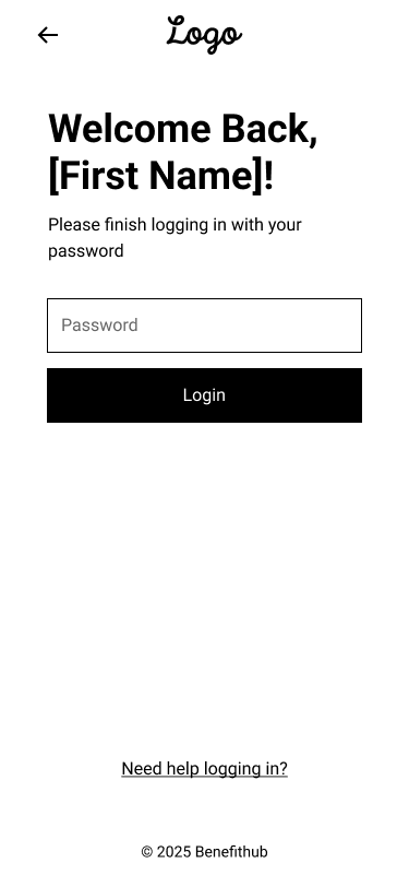
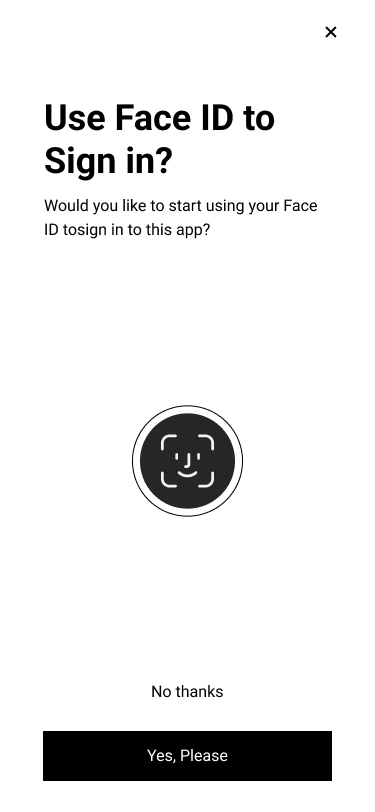
01 — Key design decision
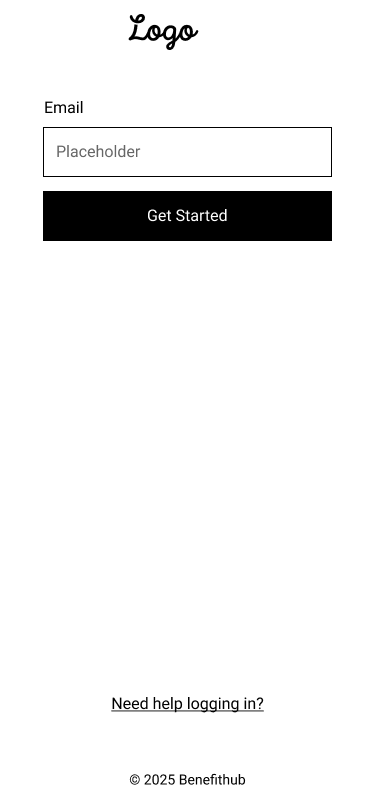
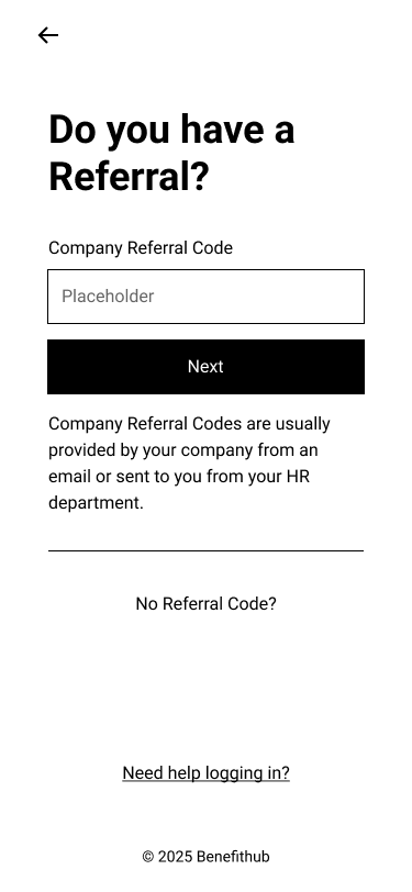
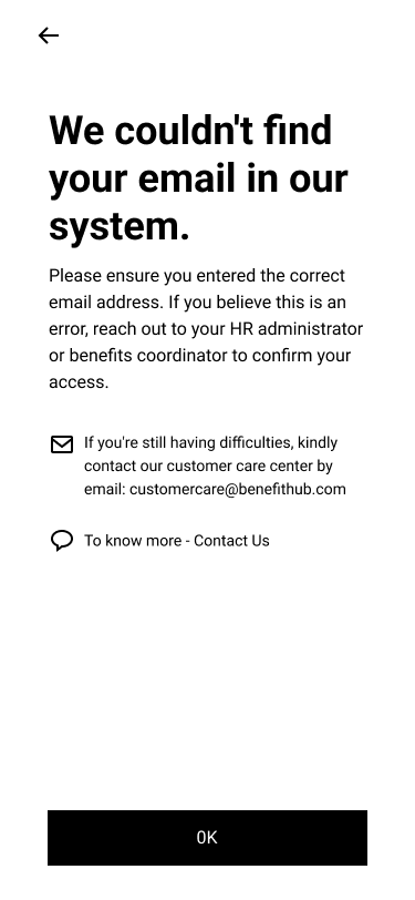
A Single Adaptive Entry Point
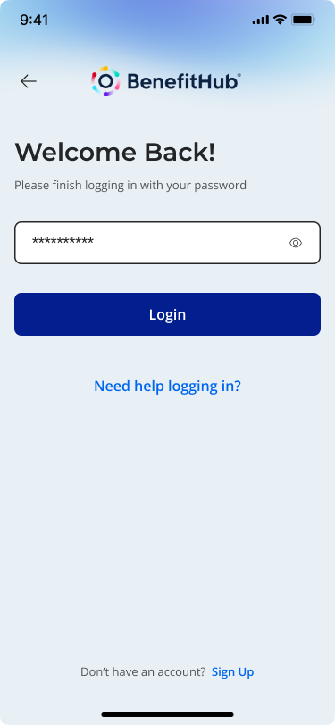
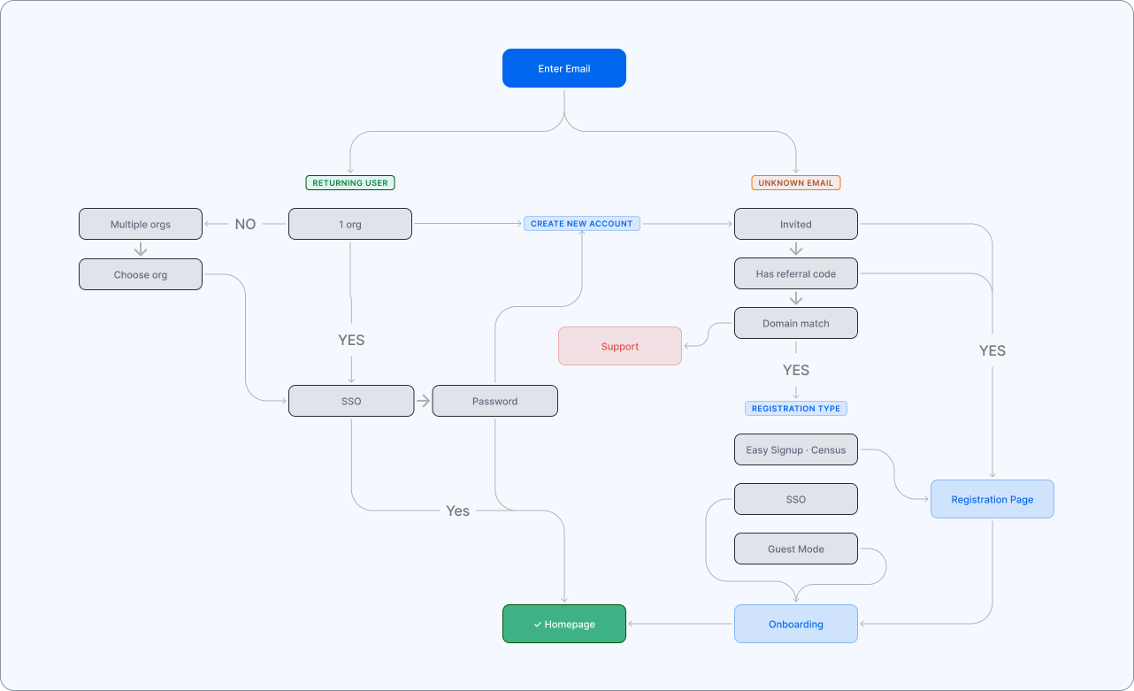
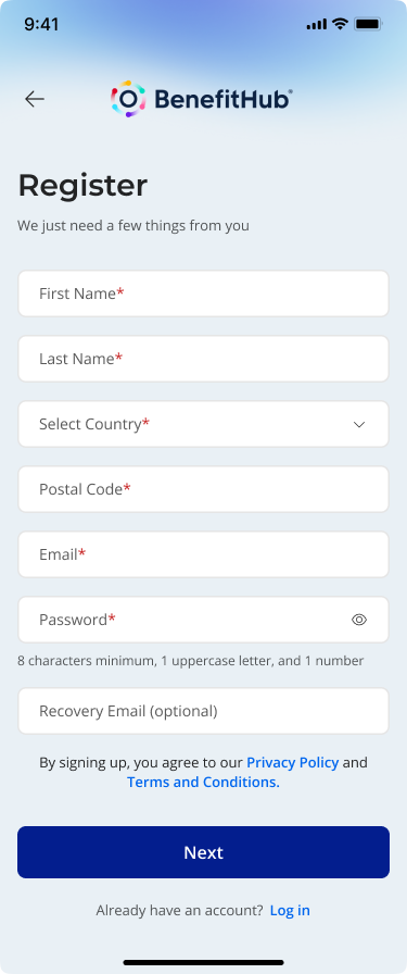
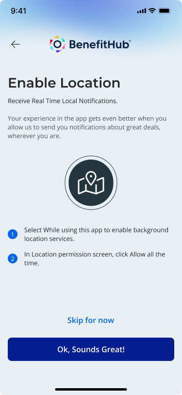
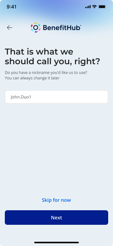
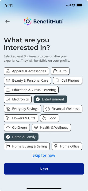
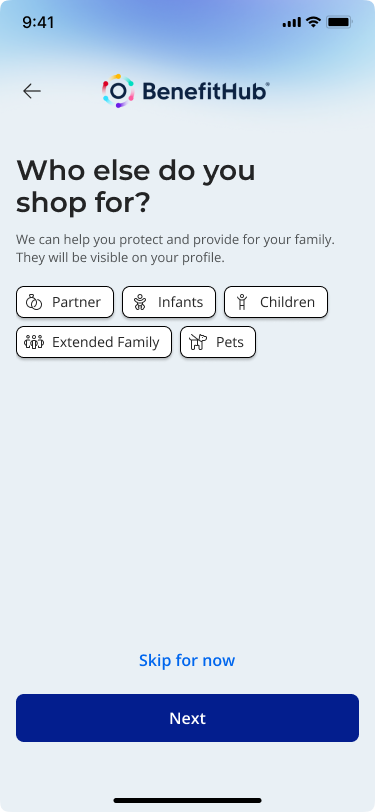
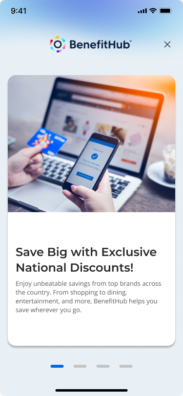
Instead of separating login, registration, and edge cases, I designed a single, adaptive entry point.
Users start by entering their email.
From there, the system handles the complexity:
→ Routes existing users to the correct login method
→ Surfaces organization selection when needed
→ Guides new users into the right registration flow
→ Handles referral codes, invitations, and domain rules in the background
This turns a fragmented system into a guided experience.
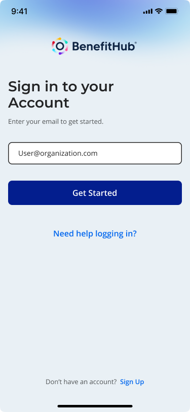
Login Flow
onboarding


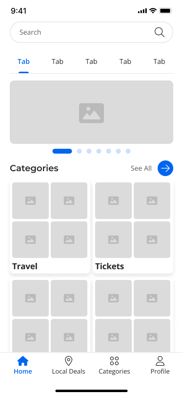
02 — Key design decision
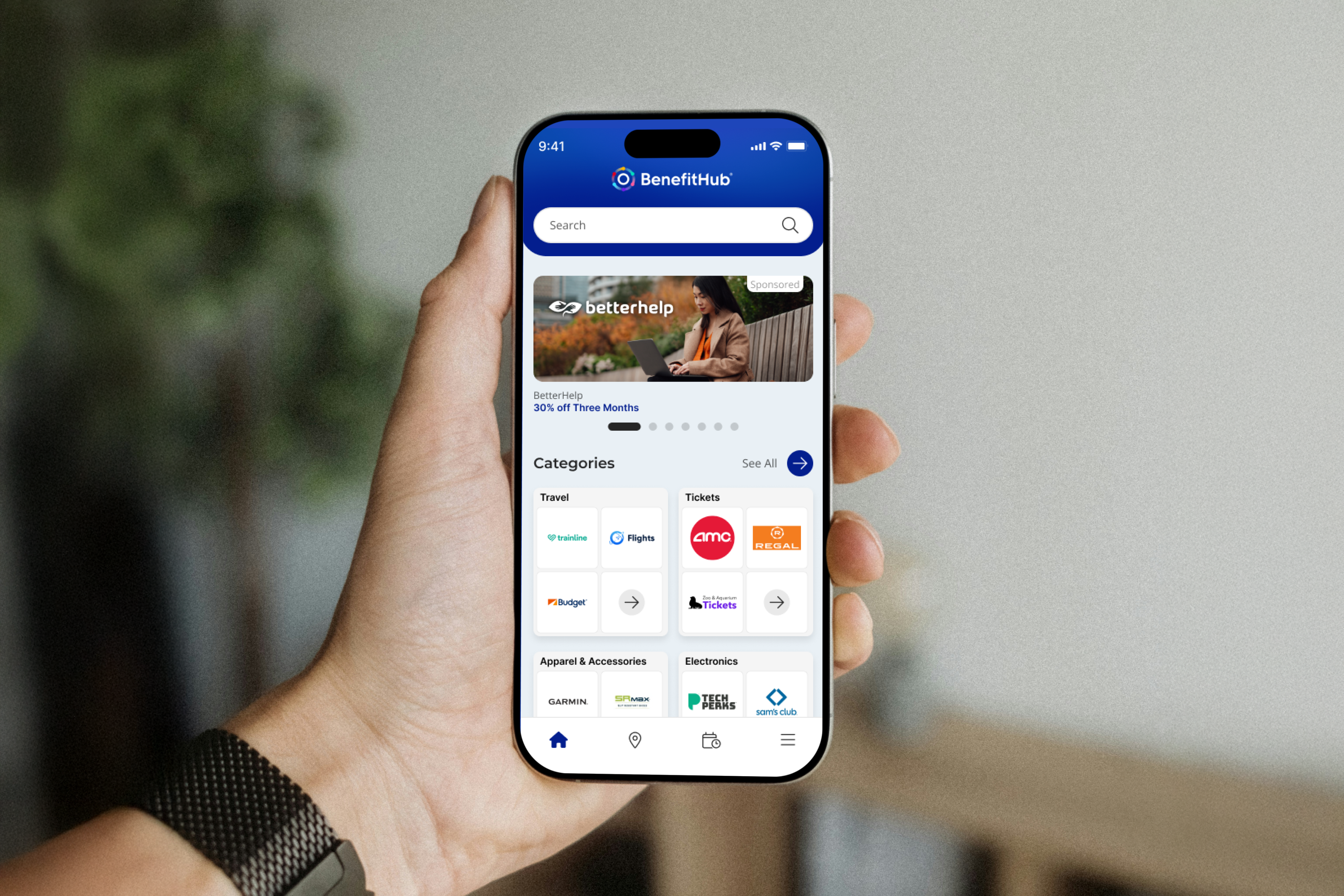
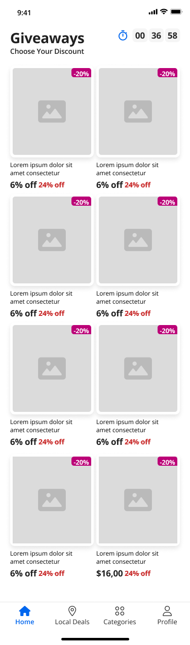
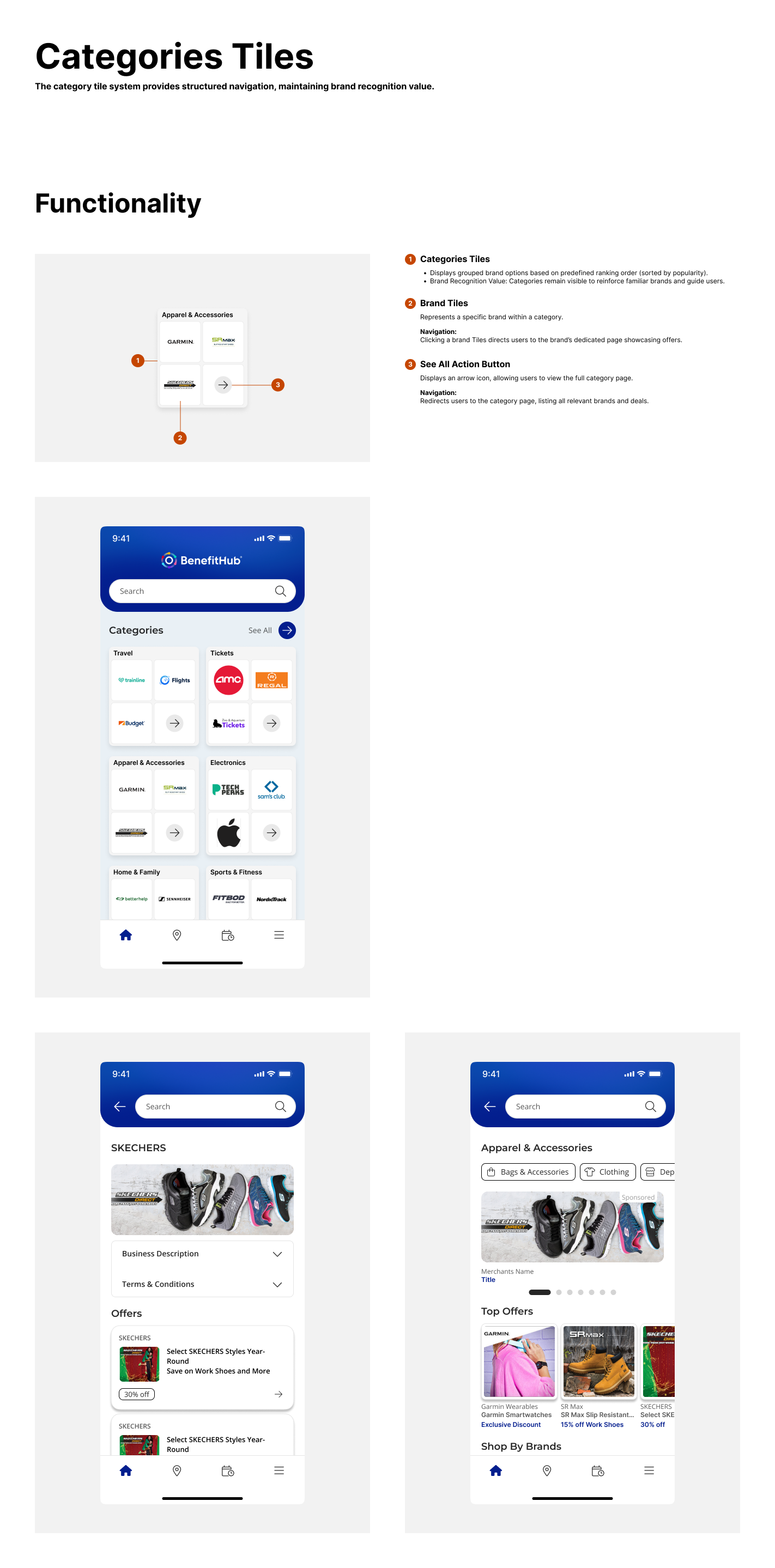
Making Deal Discovery
Feel Guided
Once inside the app, the focus shifts to
helping users find value quickly.
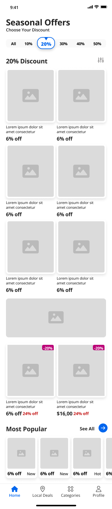
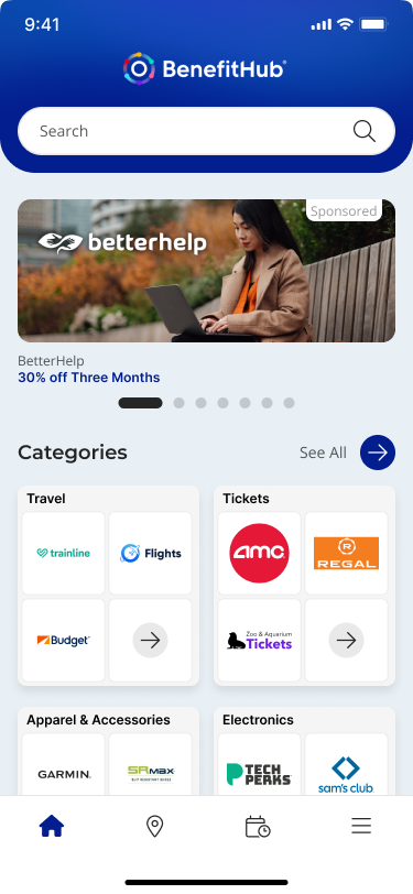
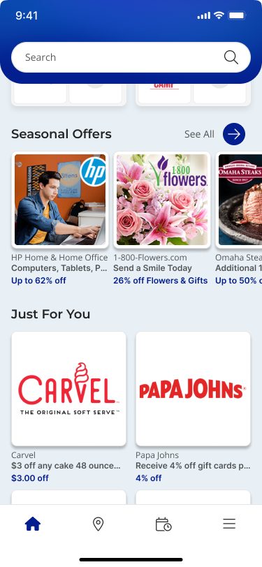
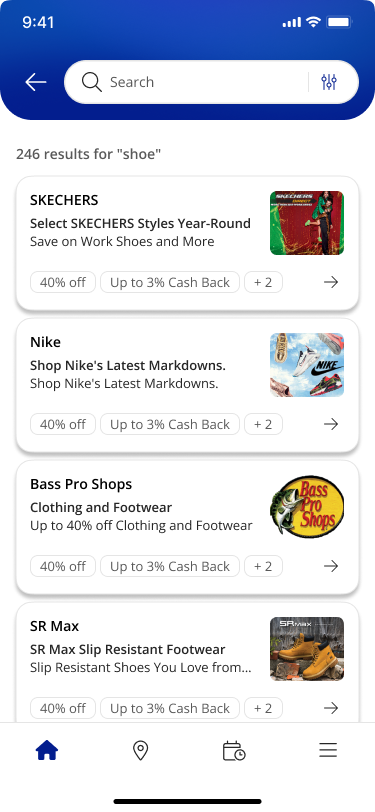
→ Inside the app, the main challenge was helping users find something relevant without overwhelming them. I introduced modular carousels that surface highlights first and give users a clear path to explore more. No more wall-of-deals on load.
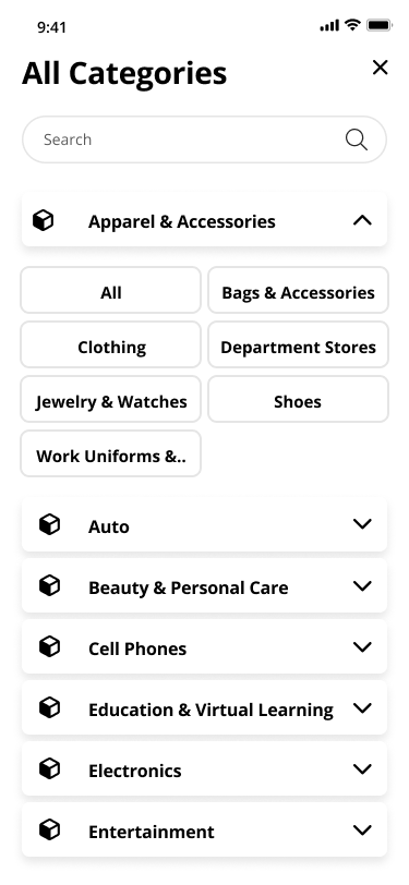
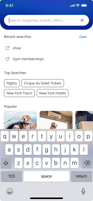
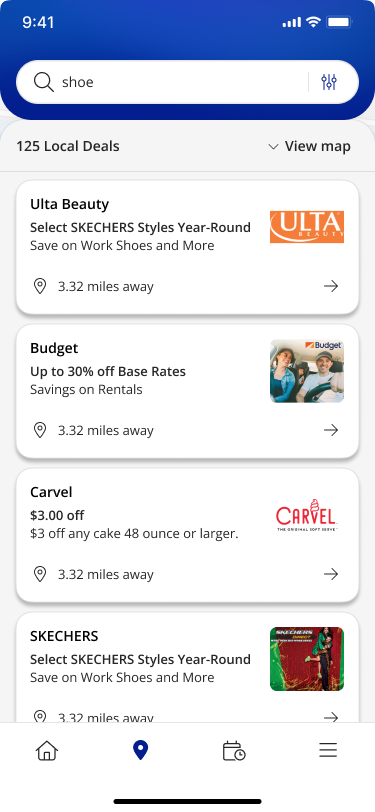
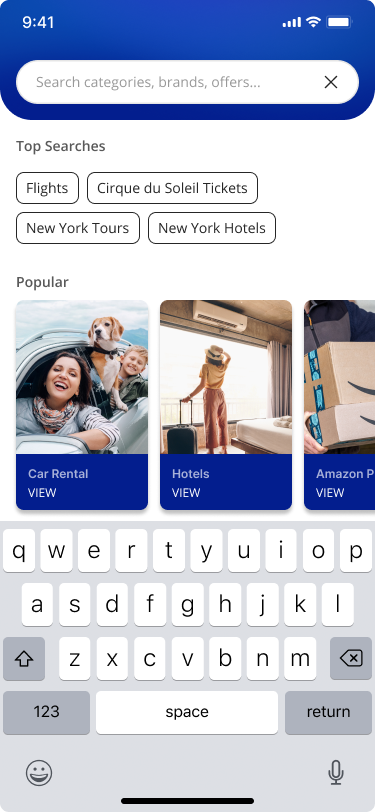
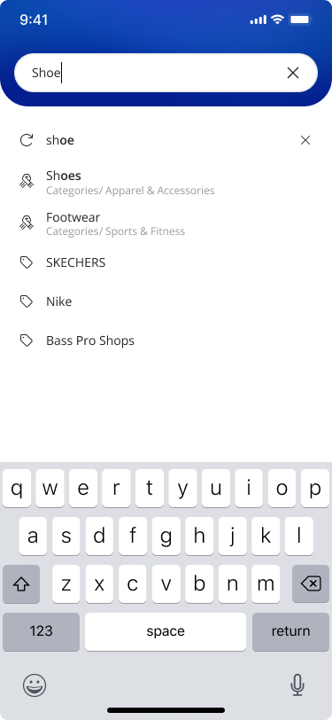
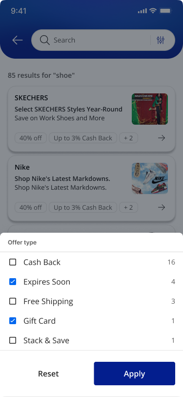
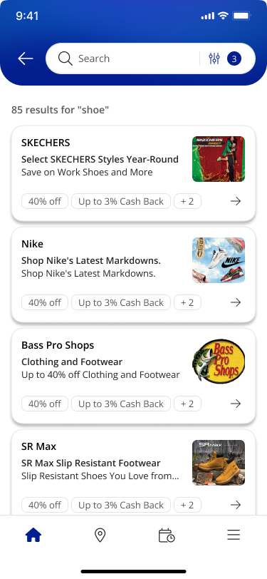
→ Search was redesigned to meet users at every stage of intent. An empty state shows curated categories and popular searches. A focused state surfaces recent activity. An active state prioritizes relevant suggestions. Each state has a job and does only that job.
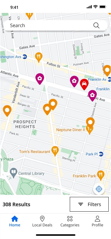
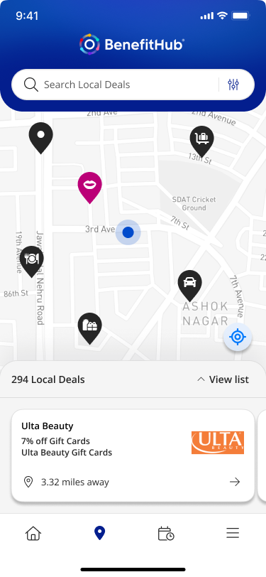
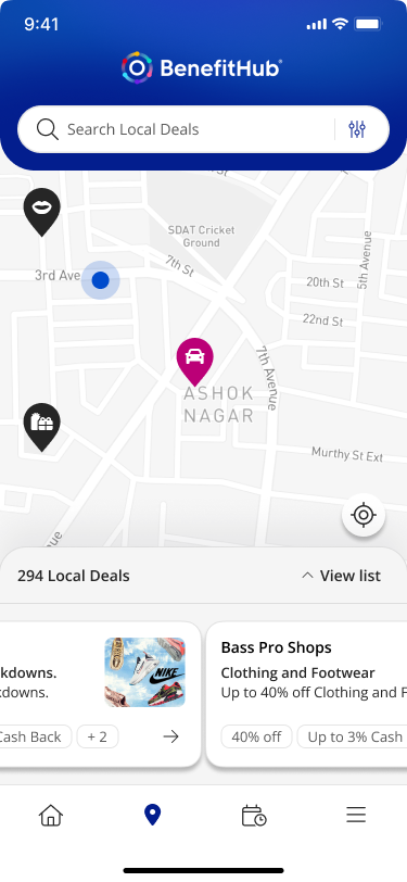
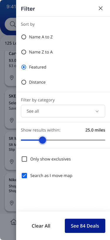
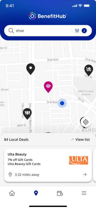
→ Local deals got a map-based view. Results update based on location and interaction, and users can switch between map and list. It makes nearby offers feel immediate instead of buried.
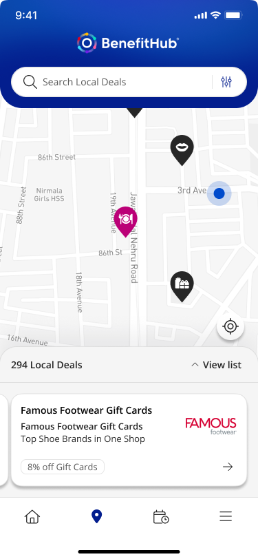
Local DEALs & Search
03 — Key design decision
Designing for Consistency
Each feature was designed as part of a system.
→ Shared interaction patterns
→ Reusable components
→ Clear behavior rules
This made the app easier to scale and easier to build.
Outcomes
Onboarding was validated through stakeholder review to have resolved the early drop-off pattern. Discovery moved from a flat, overwhelming list to a structured, intent-aware flow.
The redesign removed the friction that was costing users before they saw the product's value.
Onboarding
4 auth paths reduced to a single adaptive entry point
Discovery
Structured carousels and intent-aware search replaced flat lists
Consistency
Reusable component library scaled across all key flows
Handoff
Documented behavior rules reduced back-and-forth with engineering
What I learned
Complex systems need simple entry points.
When users have to figure out where they belong before the product helps them, you lose them before they see the value. Remove the decision. Guide the step. Trust builds from there.

Project
BenefitHub Browser Extension
Case Study
The BenefitHub Browser Extension helps members find and activate the best deals while shopping online. Available on Chrome, Safari, Edge, and Firefox, it shows cashback offers and promo codes, ensures easy activation, and reminds users to save at checkout.
See Project
→

© Simorka Designs
All Rights Reserved
Overview
OVERVIEW
Strong value. Weak experience.
BenefitHub offers access to thousands of deals and discounts across everyday categories. The value is strong, but the mobile experience made it hard to access. Users struggled to navigate, discover relevant deals, and move through onboarding without friction.
This project focused on removing the barriers between users and the value they signed up for, starting with onboarding and working through discovery.
THE PROBLEM
Users weren't struggling with the idea of saving money.
They were struggling with the experience.
The app presented a few core challenges:
Navigation felt unclear and inconsistent
Deal discovery had overwhelming lists
Login and registration flows fragmented
The app felt similar to the web.
MY ROLE
I led the design process across the mobile app experience.
Audited the existing product
Identified friction points and drop-offs
Defined a new UX direction
Designed key flows and interactions
Built reusable components in Figma
Collaborated with product and engineering
DESIGN APPROACH
I used a sprint-based process to stay focused and move at pace.
Understand
Flows, behavior, business requirements
Explore
Nav patterns, discovery directions
Decide
Prioritize friction reduction
Prototype
Interactive flows for clarity testing
Refine
Stakeholder and engineering feedback
WIREFRAMES
01 — Key design decision
A Single Adaptive Entry Point
Instead of separating login, registration, and edge cases, I designed a single, adaptive entry point.
Users start by entering their email.
From there, the system handles the complexity:
→ Routes existing users to the correct login method
→ Surfaces organization selection when needed
→ Guides new users into the right registration flow
→ Handles referral codes, invitations, and domain rules in the background
This turns a fragmented system into a guided experience.
Login Flow
onboarding
02 — Key design decision
Making Deal Discovery
Feel Guided
Once inside the app, the focus shifts to
helping users find value quickly.
→ Inside the app, the main challenge was helping users find something relevant without overwhelming them. I introduced modular carousels that surface highlights first and give users a clear path to explore more. No more wall-of-deals on load.
→ Search was redesigned to meet users at every stage of intent. An empty state shows curated categories and popular searches. A focused state surfaces recent activity. An active state prioritizes relevant suggestions. Each state has a job and does only that job.
→ Local deals got a map-based view. Results update based on location and interaction, and users can switch between map and list. It makes nearby offers feel immediate instead of buried.
Local DEALs & Search
03 — Key design decision
Designing for Consistency
Each feature was designed as part of a system.
→ Shared interaction patterns
→ Reusable components
→ Clear behavior rules
This made the app easier to scale and easier to build.
Outcomes
Onboarding was validated through stakeholder review to have resolved the early drop-off pattern. Discovery moved from a flat, overwhelming list to a structured, intent-aware flow.
The redesign removed the friction that was costing users before they saw the product's value.
Onboarding
4 auth paths reduced to a single adaptive entry point
Discovery
Structured carousels and intent-aware search replaced flat lists
Consistency
Reusable component library scaled across all key flows
Handoff
Documented behavior rules reduced back-and-forth with engineering
What I learned
Complex systems need simple entry points.
When users have to figure out where they belong before the product helps them, you lose them before they see the value. Remove the decision. Guide the step. Trust builds from there.

Project
BenefitHub Browser Extension
Case Study
The BenefitHub Browser Extension helps members find and activate the best deals while shopping online. Available on Chrome, Safari, Edge, and Firefox, it shows cashback offers and promo codes, ensures easy activation, and reminds users to save at checkout.
See Project
→
© Simorka Designs
All Rights Reserved


BenefitHub
Mobile App
A mobile app redesign for BenefitHub. Focused on simplifying onboarding, improving deal discovery, and making the experience feel as useful as the product itself.
Role
Senior UI Designer
Tools
Figma, FigJam
Platform
iOS & Android
Deliverables
Mobile App
OVERVIEW
Strong value. Weak experience.
BenefitHub offers access to thousands of deals and discounts across everyday categories. The value is strong, but the mobile experience made it hard to access. Users struggled to navigate, discover relevant deals, and move through onboarding without friction.
This project focused on removing the barriers between users and the value they signed up for, starting with onboarding and working through discovery.
THE PROBLEM
Users weren't struggling with the idea of saving money.
They were struggling with the experience.
The app presented a few core challenges:
Navigation felt unclear and inconsistent
Deal discovery had overwhelming lists
Login and registration flows fragmented
The app felt similar to the web.
MY ROLE
I led the design process across the mobile app experience.
Audited the existing product
Identified friction points and drop-offs
Defined a new UX direction
Designed key flows and interactions
Built reusable components in Figma
Collaborated with product and engineering
DESIGN APPROACH
I used a sprint-based process to stay focused and move at pace.
Understand
Flows, behavior, business requirements
Explore
Nav patterns, discovery directions
Decide
Prioritize friction reduction
Prototype
Interactive flows for clarity testing
Refine
Stakeholder and engineering feedback
WIREFRAMES
01 — Key design decision
A Single Adaptive Entry Point
Instead of separating login, registration, and edge cases, I designed a single, adaptive entry point.
Users start by entering their email.
From there, the system handles the complexity:
→ Routes existing users to the correct login method
→ Surfaces organization selection when needed
→ Guides new users into the right registration flow
→ Handles referral codes, invitations, and domain rules in the background
This turns a fragmented system into a guided experience.
Login Flow
onboarding
02 — Key design decision
Making Deal Discovery
Feel Guided
Once inside the app, the focus shifts to
helping users find value quickly.
→ Inside the app, the main challenge was helping users find something relevant without overwhelming them. I introduced modular carousels that surface highlights first and give users a clear path to explore more. No more wall-of-deals on load.
→ Search was redesigned to meet users at every stage of intent. An empty state shows curated categories and popular searches. A focused state surfaces recent activity. An active state prioritizes relevant suggestions. Each state has a job and does only that job.
→ Local deals got a map-based view. Results update based on location and interaction, and users can switch between map and list. It makes nearby offers feel immediate instead of buried.
Local DEALs & Search
03 — Key design decision
Designing for Consistency
Each feature was designed as part of a system.
→ Shared interaction patterns
→ Reusable components
→ Clear behavior rules
This made the app easier to scale and easier to build.
Outcomes
The redesign removed the friction that was costing users before they saw the product's value.
Onboarding was validated through stakeholder review to have resolved the early drop-off pattern. Discovery moved from a flat, overwhelming list to a structured, intent-aware flow.
Onboarding
4 auth paths reduced to a single adaptive entry point
Discovery
Structured carousels and intent-aware search replaced flat lists
Consistency
Reusable component library scaled across all key flows
Handoff
Documented behavior rules reduced back-and-forth with engineering
What I learned
Complex systems need simple entry points.
When users have to figure out where they belong before the product helps them, you lose them before they see the value. Remove the decision. Guide the step. Trust builds from there.

© Simorka Designs
All Rights Reserved