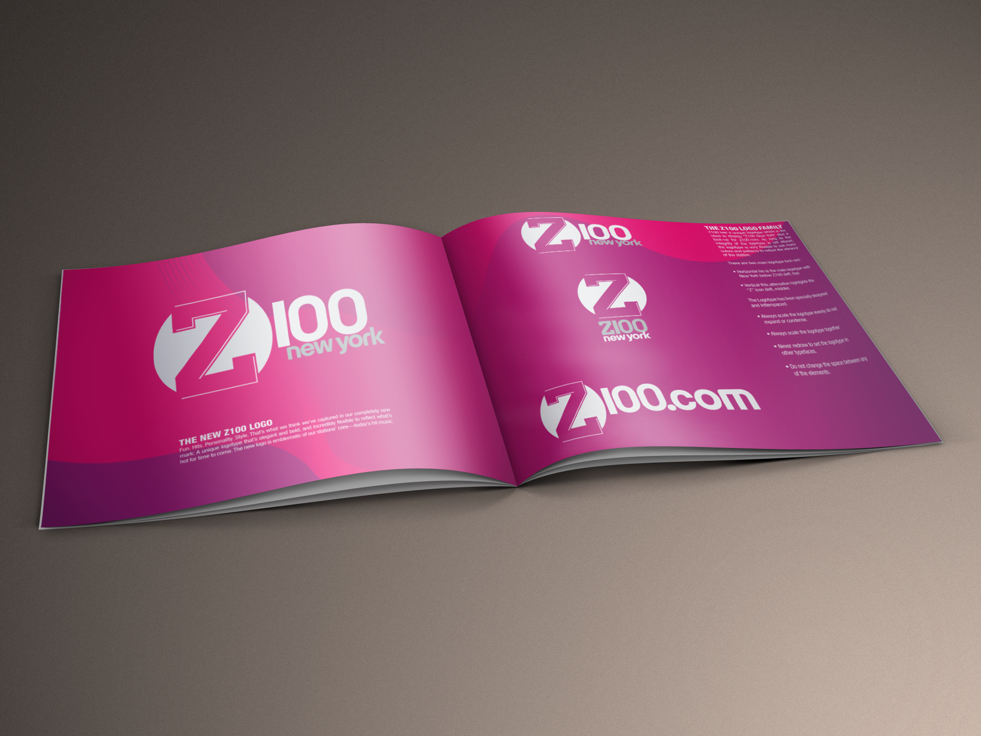
New York’s Station Z100
Branding Guides Design


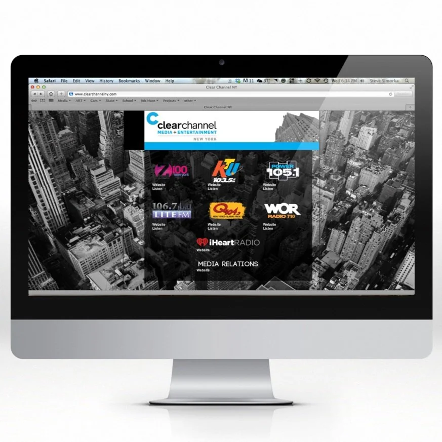
Clear Channel
New York Media Relations Website
For this project, I was tasked with designing the Clear Channel New York homepage from the ground up. The Art Director and Station Program Directors provided me with the information that I needed to include on the homepage as far as content and accessibility. I then worked closely with the Front End Web Developer to ensure that the design would function seamlessly on the site. Clear Channel’s stations are the largest in New York’s market and our vision was to emphasize this. I laid out the designs for the web pages on Photoshop, starting with a background image of the city in black and white. On top of that image is the content of the page, which provides the station logos and a link to their website as well as a link to listen. The design is simple and clear cut, drawing emphasis to the colorful logos over the photograph of the city. This contrast portrays that each station is unique from the other, while remaining an important member of the Clear Channel New York family.


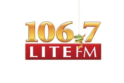
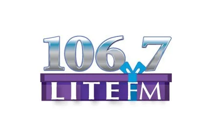
106.7Lite FM
Holiday Logo
For this project, I was responsible for creating five original holiday-inspired Lite FM Station Logos to be displayed from Black Friday to New Year’s Day. I aspired to make each logo stand alone, with a varying form of holiday spirit for the Art Director and Station Programs Directors to choose from. I was restricted to the traditional Lite FM logo color scheme as well as their holiday color scheme of red and gold. I started by taking their original holiday logo and adding the ornament as the “point” in 106.7. I thought this was a playful and tasteful way of decorating their logo without deviating from the call letters. I continued by playing on the holiday themes, adding snowflakes, snowmen, gift wrap, and a good-humored Santa. This gave the Art Director and Station PD options that fit with the specific style they were hoping to portray for the station. The ornament logo was chosen for its elegance and simplicity.


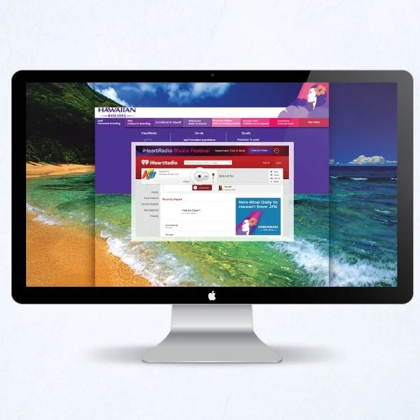
Hawaiian Airlines
Links Presentation Site
I had the opportunity to design and layout the portal page for Hawaiian Airlines. This presentation showcases all of the ad space purchased by Hawaiian Airlines over the course of 2012. Ads range from banner ads to airtime promos. I utilized the Hawaiian Airlines logo and color scheme to simplify the content, making it easy to access and navigate while emphasizing Hawaii’s breathtaking beauty. The airline provided me with assets to work with while the Web Developer and I compiled the content for the site. I used photos provided by the airline to create an enjoyable experience for the clientele, reminding them of their purpose and forming a focal point of Hawaii’s beauty. The Web Developer and I decided the site should include receding drop-down menus, while navigating between content the viewer would be brought back to the image of the beach.


