Intro
Chipotle built its brand on personality and purpose. Their irreverent voice and commitment to real ingredients give them a genuine connection with customers. What they simply call "Food."
My role
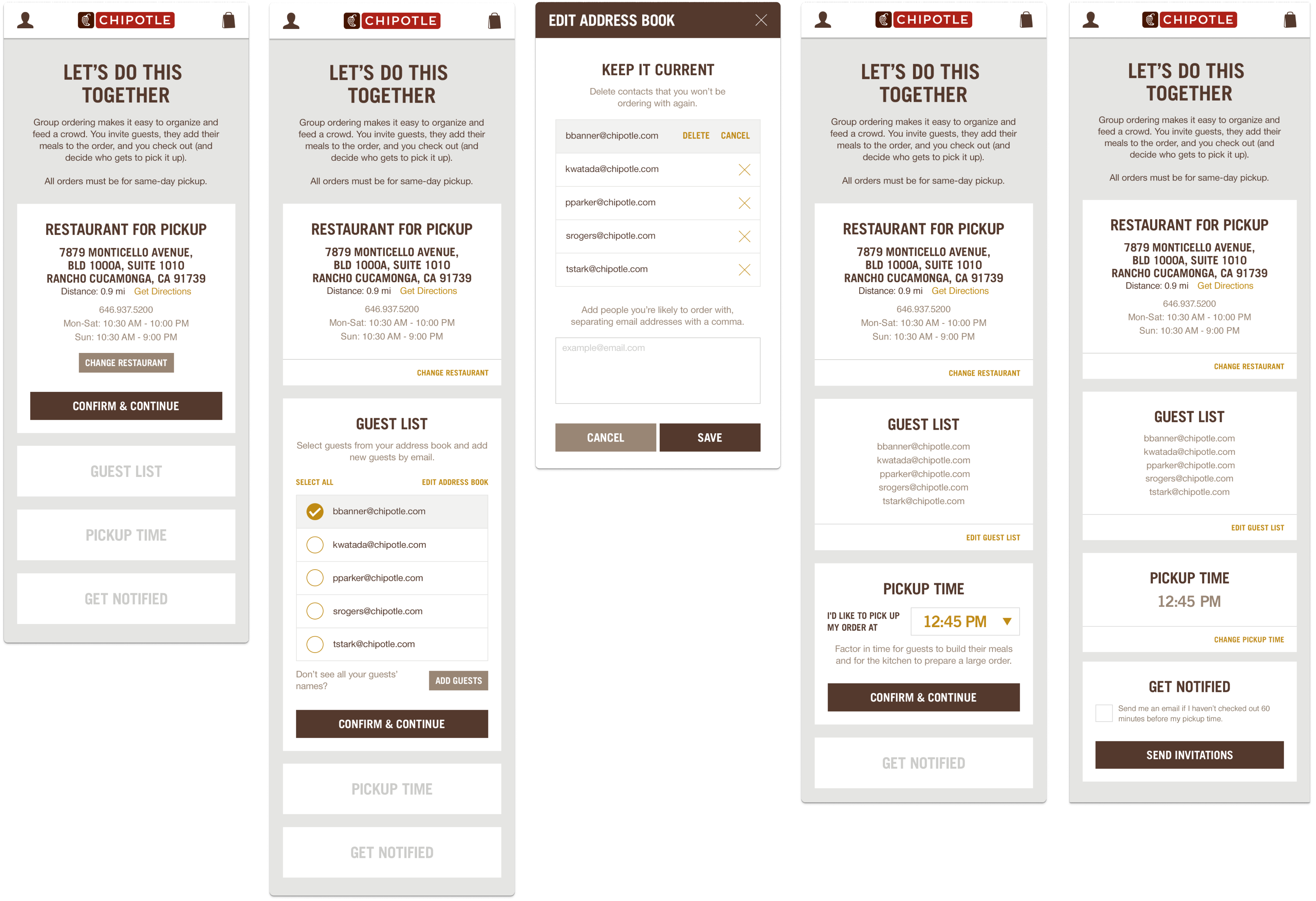
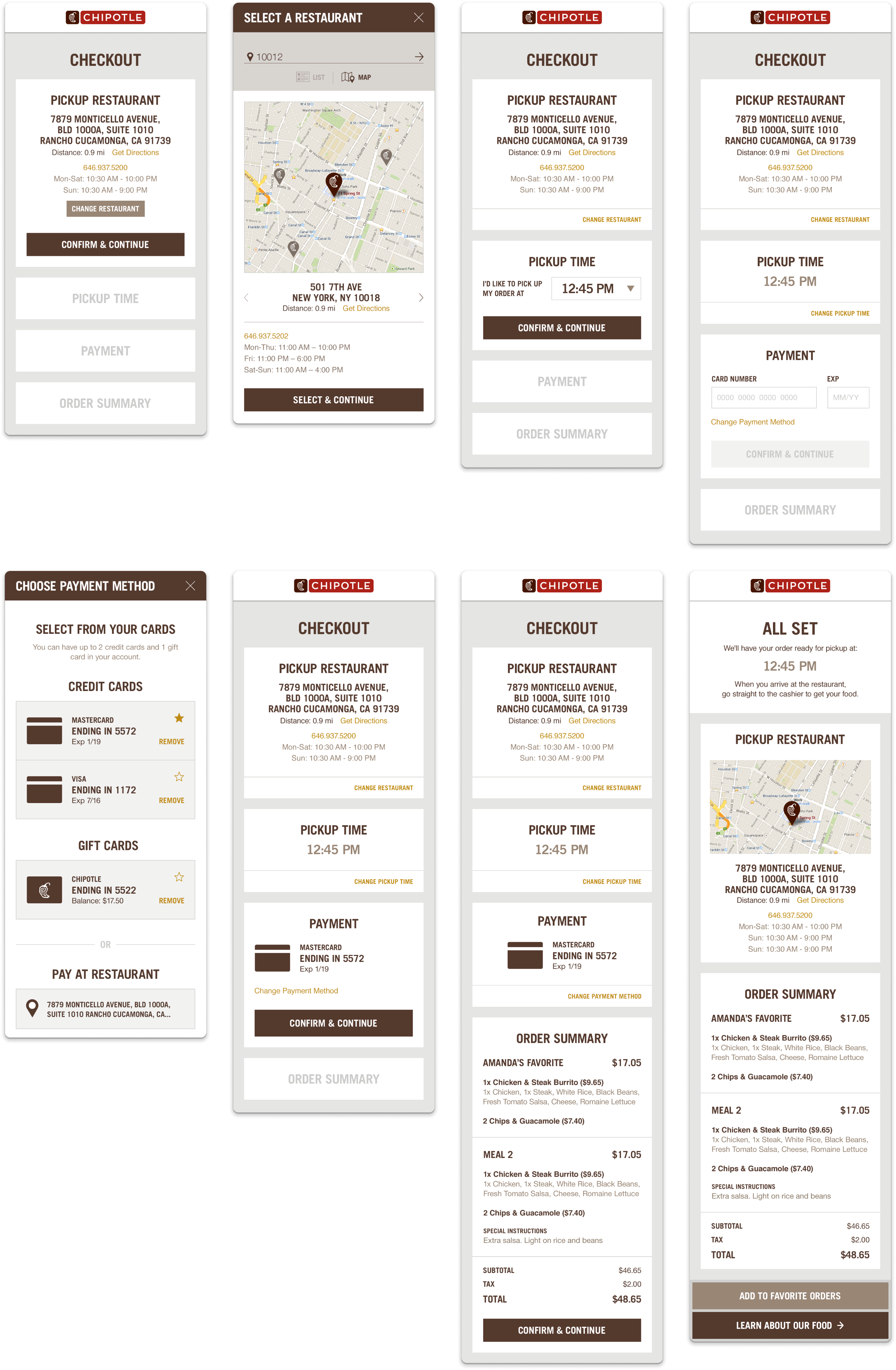
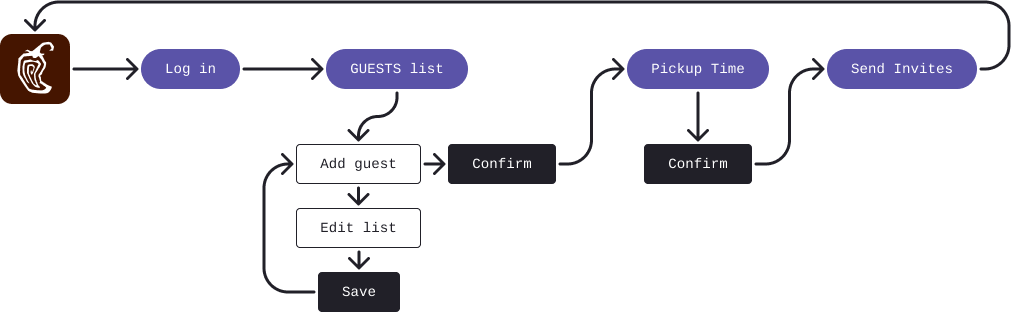
I collaborated on web and mobile layouts within Chipotle's existing brand and messaging framework. My primary focus was the responsive online ordering bag experience, a group ordering platform that let one host manage an entire party's meals through a single, unified checkout flow.
The Challenge
Chipotle needed a simple but scalable multi-order structure. The goal was a platform where one person could manage orders for up to 60 guests without it feeling overwhelming. That meant designing for clarity, hierarchy, and control at every step.
User Workflows
Evolution
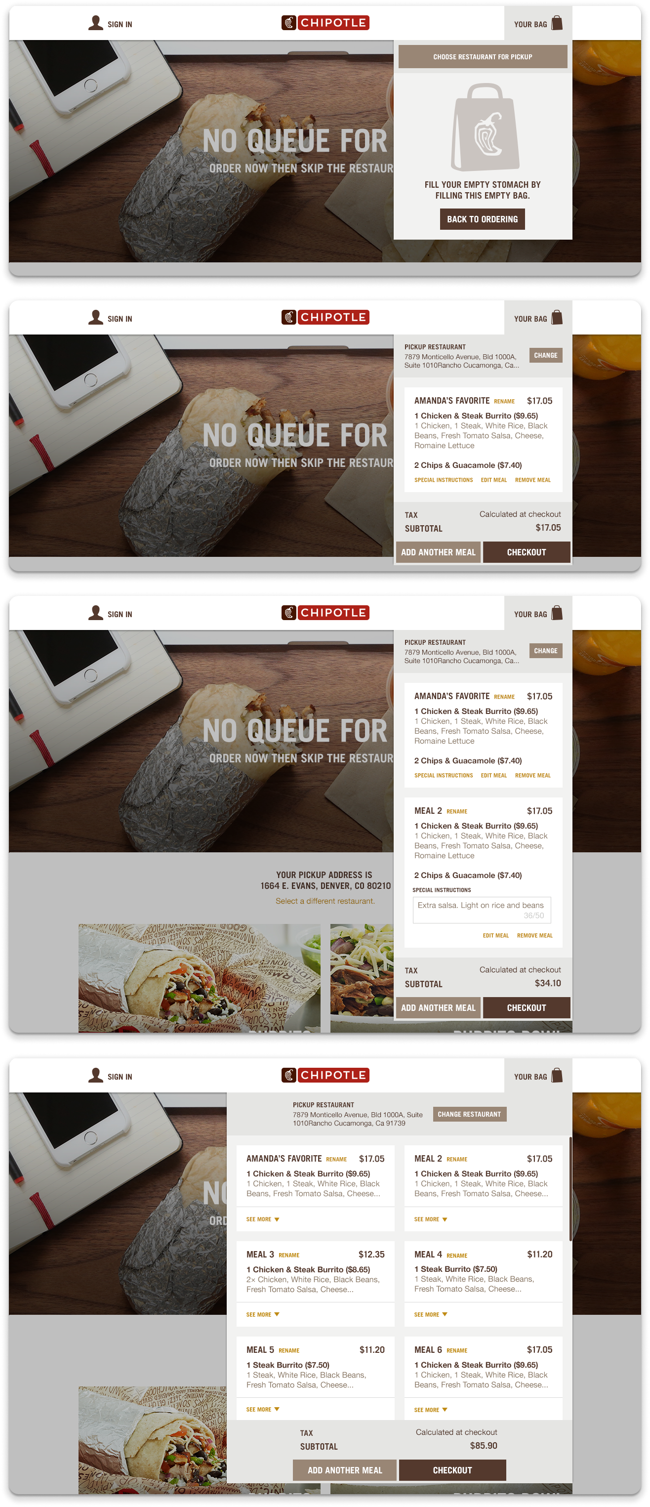
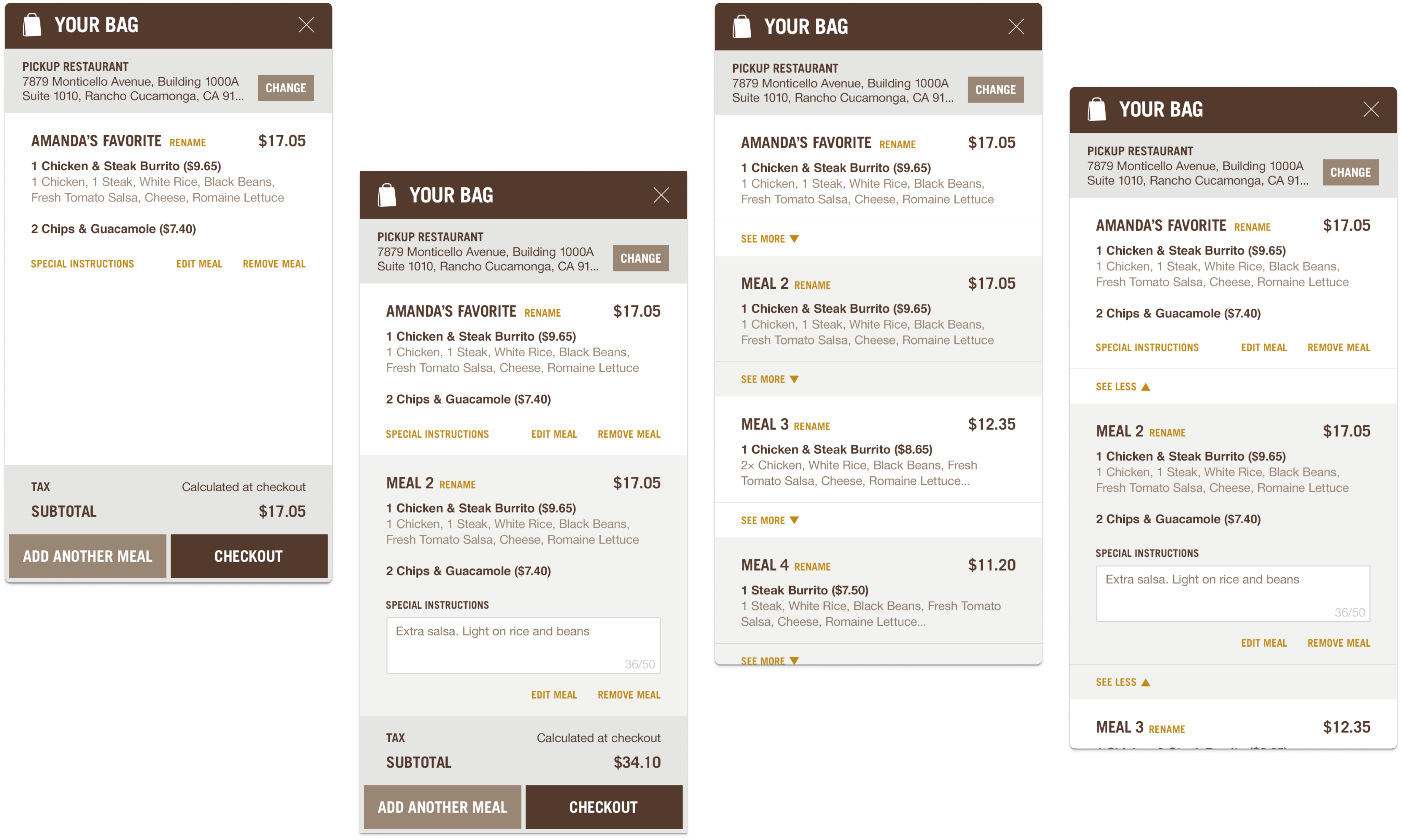
The Bag experience went through a significant redesign once we had to balance a single guest's order against the complexity of a large group. An early single-column "Zebra Stripe" pattern worked at small scale, alternating light and dark rows to separate meals visually. But under a full group load, it created sensory overload fast.
I proposed a bag that scaled with the group. Under four orders, it stayed a single column. At four or more, it expanded to a two-column tile layout. Each tile could expand to show order details and collapse to reduce clutter. The layout responded to the data, not the other way around.
We also added three tabs at the top of the bag: In Bag, Pending, and Declined. The host always knew exactly where each guest stood.